
本文将讲解如何通过自定义,实现单页面的步骤条组件。其中每个步骤的元素里都是界面设计器拖出来的。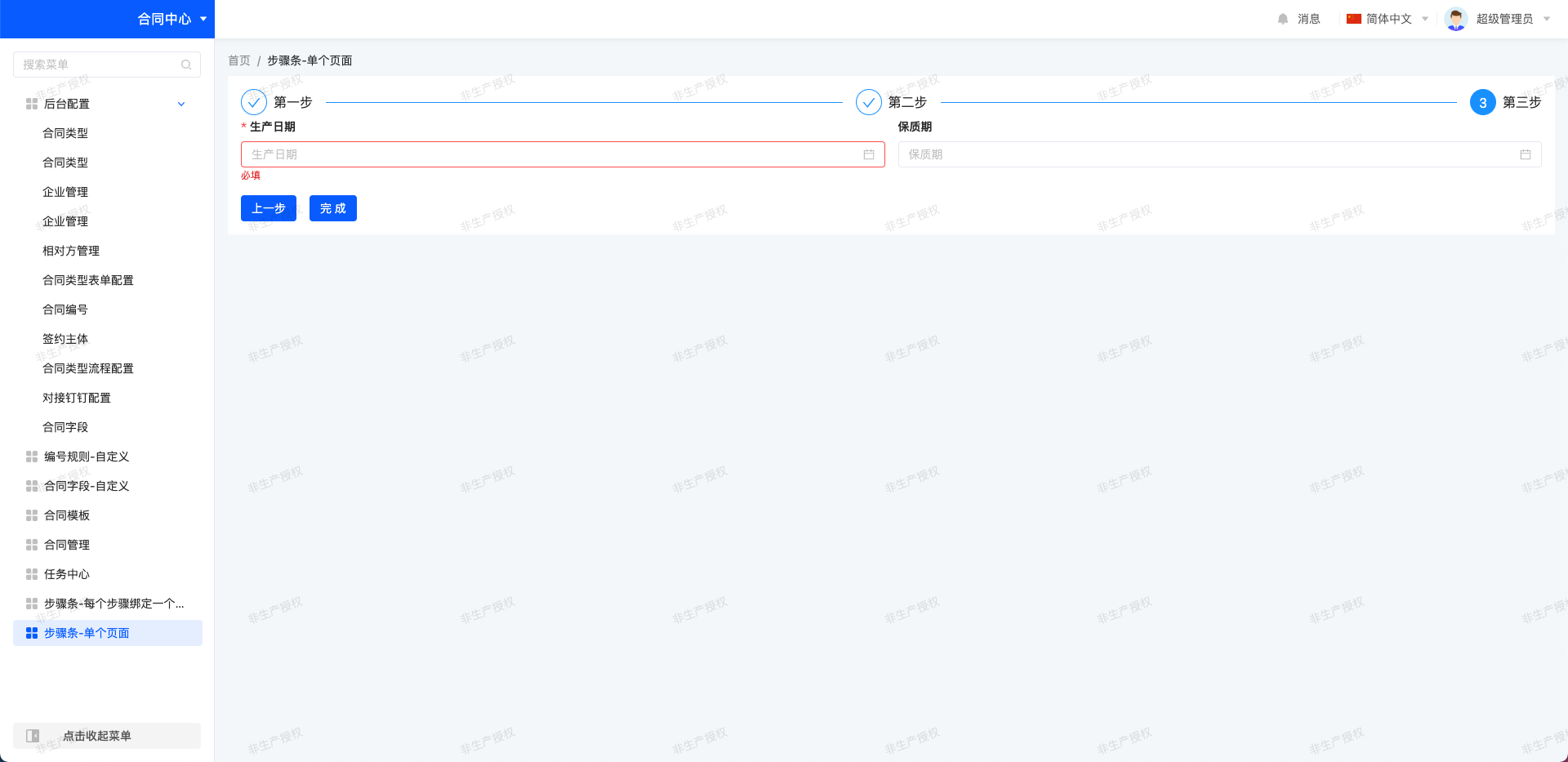

实现路径
整体的实现思路是界面设计器拖个选项卡组件,自定义这个选项卡,里面的每个选项页都当成一步渲染出来,每一步的名称是选项页的标题。
1. 界面设计器拖出页面
我们界面设计器拖个选项卡组件,然后在每个选项页里拖拽任意元素。完成后点击右上角九宫格,选中选项卡,填入组件 api 名称,作用是把选项卡切换成我们自定义的步骤条组件,这里的 api 名称和自定义组件的 widget 对应。最后发布页面,并绑定菜单。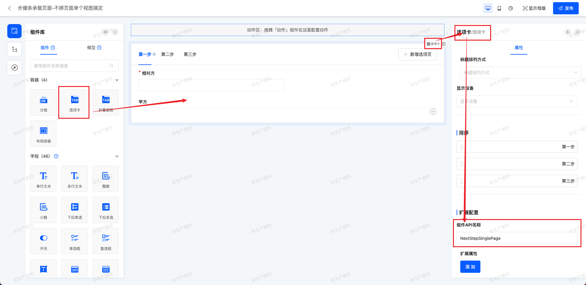
2. 组件实现
widget 组件重写了选项卡,核心函数 renderStep,通过 DslRender.render 方法渲染界面设计器拖拽的元素,每一步的 step 又是解析选卡页得到的。
import {
  SPI,
  Widget,
  DefaultTabsWidget,
  BasePackWidget,
  DslDefinition,
  DslRender,
  DslDefinitionType,
  CallChaining,
  customMutation
} from '@oinone/kunlun-dependencies';
import { VNode } from 'vue';
import NextStepSinglePage from './NextStepSinglePage.vue';

@SPI.ClassFactory(BasePackWidget.Token({ widget: 'NextStepSinglePage' }))
export class NextStepSinglePageWidget extends DefaultTabsWidget {
  public initialize(props) {
    super.initialize(props);
    this.setComponent(NextStepSinglePage);
    return this;
  }

  @Widget.Reactive()
  public get invisible() {
    return false;
  }

  // 配置的每一步名称,解析选项页的标题
  @Widget.Reactive()
  public get titles() {
    return this.template?.widgets?.map((item) => item.title) || [];
  }

  // region 上一步下一步配置

  // 步骤数组,数组里的元素即步骤要渲染的内容
  @Widget.Reactive()
  public get steps(): DslDefinition[] {
    // 每个 tab 是一个步骤,这里会有多个步骤
    // 每个步骤里有多个元素,又是数组
    // 所以这里是二维数组
    const tabDsls: DslDefinition[][] = this.template?.widgets.map((item) => item.widgets) || [];

    // 对每个步骤的子元素们,外侧包一层 row 布局,所以变回了一维数组
    return tabDsls.map((tabDsl) => {
      return {
        ...(this.template || {}),
        dslNodeType: DslDefinitionType.PACK,
        widgets: tabDsl,
        widget: 'row',
        resolveOptions: {
          mode: 1
        }
      };
    });
  }

  // 渲染步骤,每个步骤有多个子元素
  @Widget.Method()
  public renderStep(step: DslDefinition): VNode | undefined {
    return DslRender.render(step);
  }

  // region 校验相关

  // 校验的钩子
  @Widget.Reactive()
  @Widget.Inject('validatorCallChaining')
  protected parentValidatorCallChaining: CallChaining<boolean> | undefined;

  // 校验步骤表单
  @Widget.Method()
  public async onValidator(): Promise<boolean> {
    const res = await this.parentValidatorCallChaining?.syncCall();
    return res ?? true;
  }

  // region 数据提交相关

  // 提交数据的方法
  @Widget.Method()
  public async onSave() {
    const submitData = this.formData;
    await customMutation(this.model.model, 'create', submitData || {});
    window.history.back();
  }
}vue组件核心内容是用component :is属性,渲染出配置的选项页组件
<template>
  <div class="next-step">
    <a-steps :current="current">
      <a-step v-for="title in titles" :title="title" />
    </a-steps>
    <OioSpin :loading="loading" class="oio-spin">
      <div class="step-main">
        <template v-for="(stepEl, index) in stepsVNodes">
          <div v-if="current === index" class="step-item">
            <component :is="stepEl" />
          </div>
        </template>
      </div>
      <div class="step-footer" v-if="stepsVNodes.length">
        <a-button v-if="current > 0" class="oio-button" type="primary" @click="previous"> 上一步 </a-button>
        <a-button v-if="current < stepsVNodes.length - 1" class="oio-button" type="primary" @click="next">
          下一步
        </a-button>
        <a-button v-if="current === stepsVNodes.length - 1" class="oio-button" type="primary" @click="finish">
          完成
        </a-button>
      </div>
    </OioSpin>
  </div>
</template>
<script setup lang="ts">
import { computed, PropType, ref, VNode } from 'vue';
import { OioSpin } from '@oinone/kunlun-vue-ui-antd';
import { DslDefinition } from '@oinone/kunlun-dependencies';

const props = defineProps({
  loading: {
    type: Boolean,
    default: false
  },
  titles: {
    type: Array as PropType<string[]>,
    default: []
  },
  steps: {
    type: Array as PropType<DslDefinition[][]>,
    default: []
  },
  renderStep: {
    type: Function as PropType<(step: DslDefinition[]) => VNode[]>
  },
  onValidator: {
    type: Function
  },
  onSave: {
    type: Function
  }
});

const stepsVNodes = computed(() => {
  return props.steps?.map((step) => props.renderStep?.(step));
});

const current = ref<number>(0);

const next = async () => {
  if (await props.onValidator?.()) {
    current.value++;
  }
};
const previous = async () => {
  // if (await props.onValidator?.()) {
  current.value--;
  // }
};
const finish = async () => {
  if (await props.onValidator?.()) {
    props.onSave?.();
  }
};
</script>
<style lang="scss" scoped>
.next-step {
  height: 100%;
  background-color: #fff;
  padding: 16px;

  .step-main {
    display: flex;
    justify-content: flex-start;

    .step-item {
      width: 100%;
    }
  }

  .step-footer {
    display: flex;
    justify-content: flex-start;
    align-items: center;
    gap: 16px;
    margin-top: 18px;
  }
}
</style>
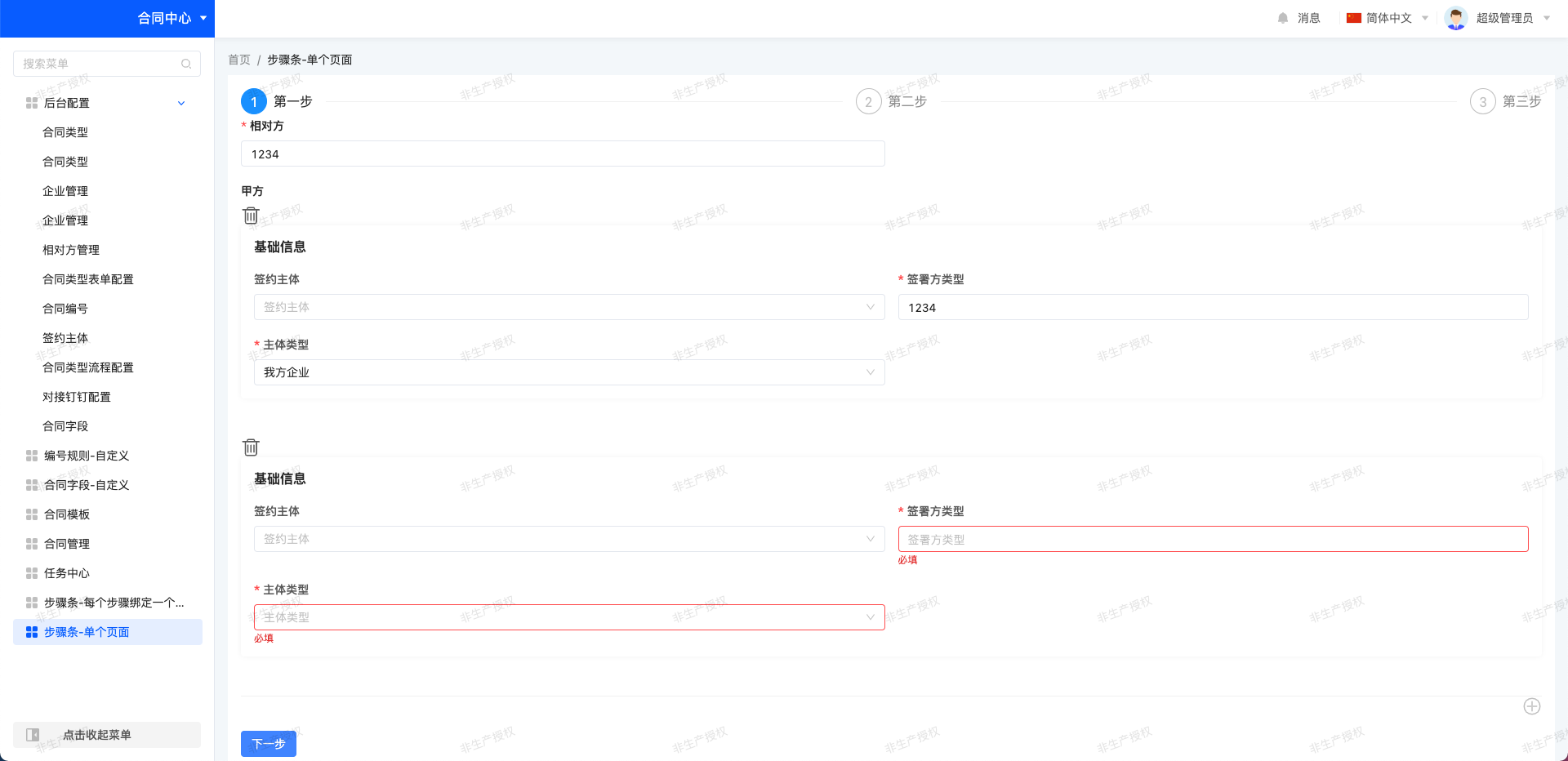
3. 效果
Oinone社区 作者:银时原创文章,如若转载,请注明出处:https://doc.oinone.top/frontend/components/21333.html
访问Oinone官网:https://www.oinone.top获取数式Oinone低代码应用平台体验