
本文将讲解如何通过自定义,实现容器内的左右两个元素,通过左右拖拽分隔线,灵活调整宽度。其中左右元素里的内容都是界面设计器拖出来的。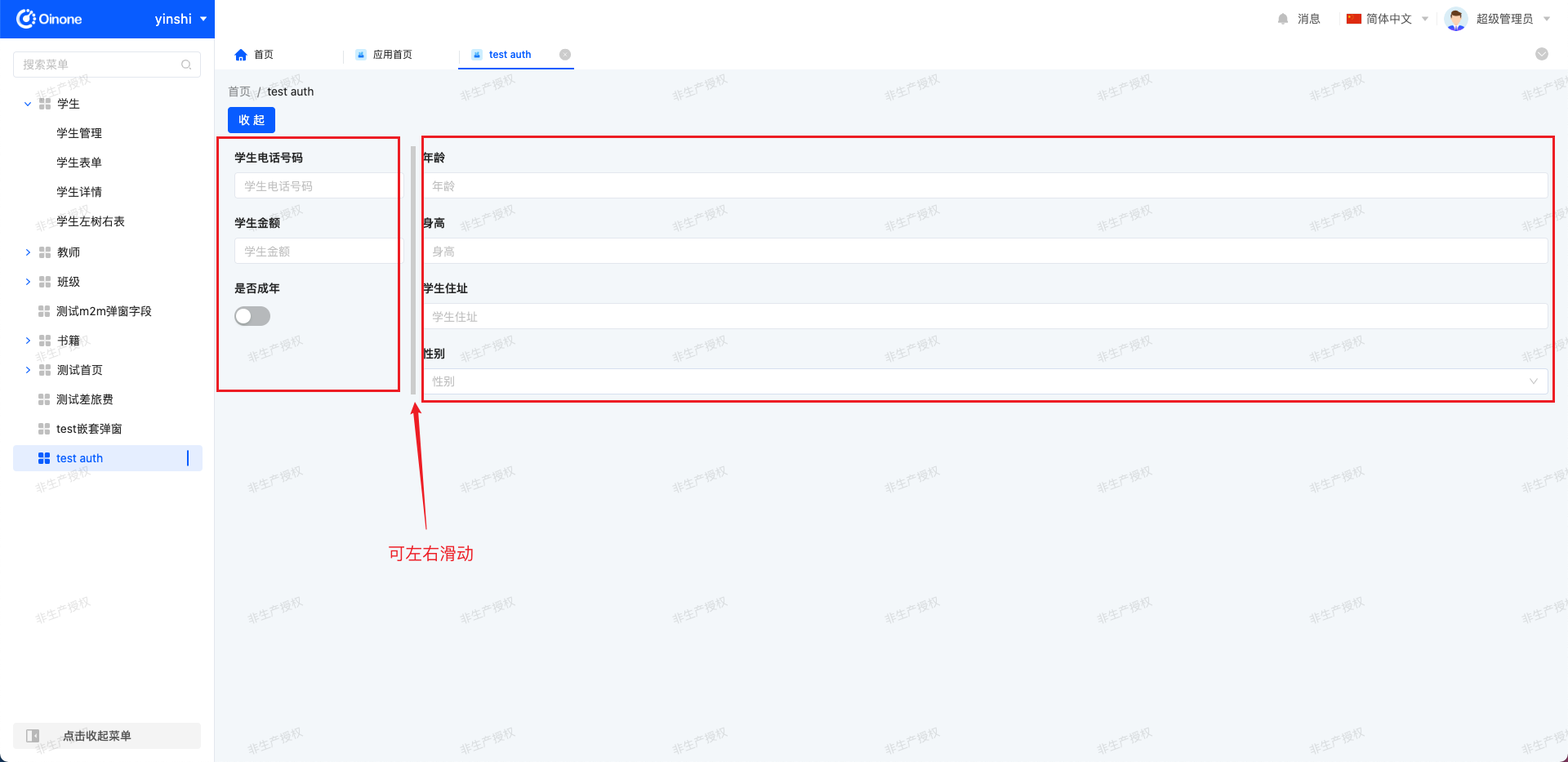

实现路径
1. 界面设计器拖出页面
我们界面设计器拖个布局容器,然后在左右容器里拖拽任意元素。完成后点击右上角九宫格,选中布局容器,填入组件 api 名称,作用是把布局容器切换成我们自定义的左右滑动组件,这里的 api 名称和自定义组件的 widget 对应。最后发布页面,并绑定菜单。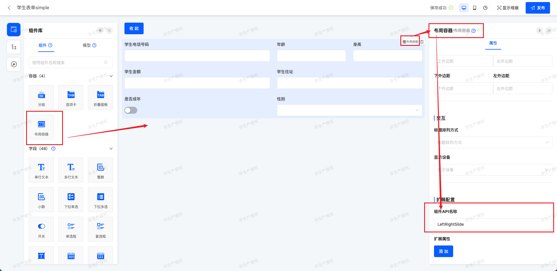
2. 组件实现
widget 组件重写了布局容器,核心函数 renderLeft、renderRight,通过 DslRender.render 方法渲染界面设计器拖拽的元素。
import {
  BasePackWidget,
  DefaultContainersWidget,
  DslDefinition,
  DslRender,
  SPI,
  Widget
} from '@oinone/kunlun-dependencies';
import LeftRightSlide from './LeftRightSlide.vue';

// 拿到界面设计器配置的子容器元素
function fetchContainerChildren(widgets?: DslDefinition[], level = 3): DslDefinition[] {
  if (!widgets) {
    return [];
  }
  const children: DslDefinition[] = [];
  for (const widget of widgets) {
    if (widget.widget === 'container') {
      children.push(widget);
    } else if (level >= 1) {
      fetchContainerChildren(widget.widgets, level - 1).forEach((child) => children.push(child));
    }
  }
  return children;
}

@SPI.ClassFactory(BasePackWidget.Token({ widget: 'LeftRightSlide' }))
export class LeftRightSlideWidget extends DefaultContainersWidget {
  public initialize(props) {
    super.initialize(props);
    this.setComponent(LeftRightSlide);
    return this;
  }

  // 获取容器的子元素
  public get containerChildren(): DslDefinition[] {
    return fetchContainerChildren(this.template?.widgets);
  }

  // 初始宽度配置
  @Widget.Reactive()
  public get initialLeftWidth() {
    return this.getDsl().initialLeftWidth || 400;
  }
  // 最小左宽度配置
  @Widget.Reactive()
  public get minLeftWidth() {
    return this.getDsl().minLeftWidth || 200;
  }
  // 最小右宽度配置
  @Widget.Reactive()
  public get minRightWidth() {
    return this.getDsl().minRightWidth || 200;
  }

  // 根据容器子元素渲染左侧
  @Widget.Method()
  public renderLeft() {
    // 把容器的第一个元素作为左侧
    const containerLeft = this.containerChildren[0];
    if (containerLeft) {
      return DslRender.render(containerLeft);
    }
  }

  // 根据容器子元素渲染右侧
  @Widget.Method()
  public renderRight() {
    // 把容器的第二个元素作为右侧
    const containerRight = this.containerChildren[1];
    if (containerRight) {
      return DslRender.render(containerRight);
    }
  }
}vue组件核心内容是用component :is属性,渲染出配置的容器组件
<template>
<div class="LeftRightSlide">
<div class="panel left-panel" :style="{ width: leftWidth + 'px' }">
<component :is="leftComponent" />
</div>
<div class="splitter-bar" @mousedown="startDrag"></div>
<div class="panel right-panel">
<component :is="rightComponent" />
</div>
</div>
</template>
<script lang="ts">
import { computed, defineComponent, ref } from 'vue';
export default defineComponent({
name: 'LeftRightSlide',
components: {},
props: {
renderLeft: {
type: Function
},
renderRight: {
type: Function
},
initialLeftWidth: {
type: Number,
default: 400
},
minLeftWidth: {
type: Number,
default: 200
},
minRightWidth: {
type: Number,
default: 200
}
},
setup(props) {
const leftComponent = computed(() => props.renderLeft?.());
const rightComponent = computed(() => props.renderRight?.());
const leftWidth = ref(props.initialLeftWidth);
const startDrag = (e: MouseEvent) => {
const startX = e.clientX;
const startWidth = leftWidth.value;
const onMouseMove = (moveEvent: MouseEvent) => {
const delta = moveEvent.clientX - startX;
const newLeftWidth = Math.max(props.minLeftWidth, startWidth + delta);
leftWidth.value = newLeftWidth;
};
const onMouseUp = () => {
window.removeEventListener('mousemove', onMouseMove);
window.removeEventListener('mouseup', onMouseUp);
};
window.addEventListener('mousemove', onMouseMove);
window.addEventListener('mouseup', onMouseUp);
};
return {
leftComponent,
rightComponent,
leftWidth,
startDrag
};
}
});
</script>
<style lang="scss">
.LeftRightSlide {
display: flex;
height: 100%;
width: 100%;
overflow: hidden;
position: relative;
.panel {
height: 100%;
overflow: auto;
}
.left-panel {
}
.right-panel {
flex: 1;
}
.splitter-bar {
width: 6px;
cursor: col-resize;
background-color: #ccc;
position: relative;
z-index: 1;
transition: background-color 0.2s;
&:hover {
background-color: #999;
}
}
}
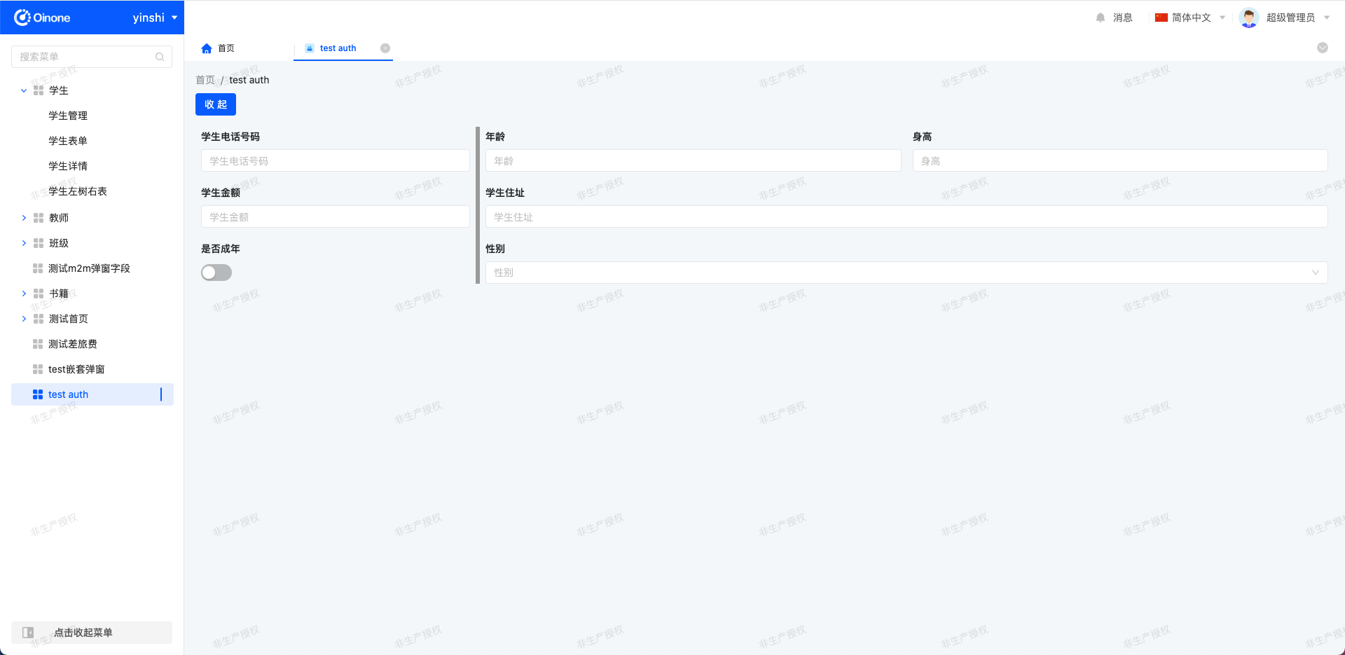
</style>3. 效果
Oinone社区 作者:银时原创文章,如若转载,请注明出处:https://doc.oinone.top/frontend/components/21328.html
访问Oinone官网:https://www.oinone.top获取数式Oinone低代码应用平台体验