
在页面交互中,样式的变化是前端核心工作之一。本文介绍如何在Oinone平台中根据主题变化自定义组件样式。
介绍
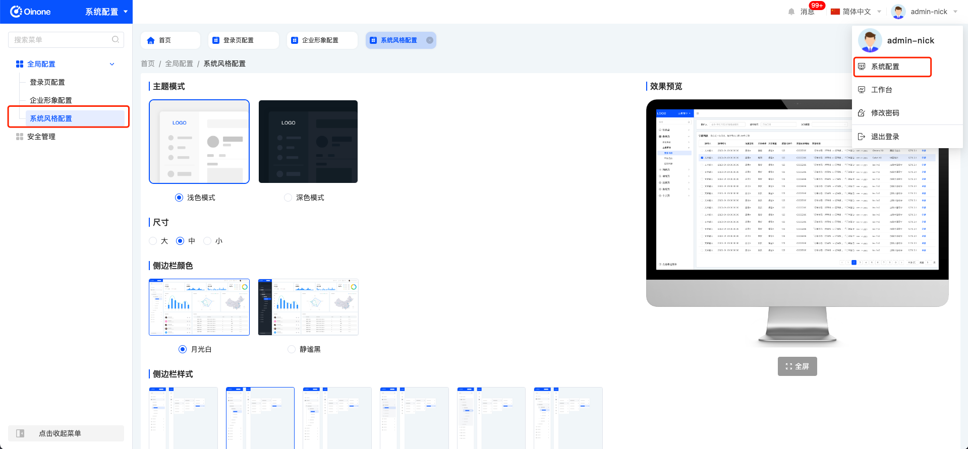
Oinone平台提供了六种不同的主题设置,浅色大主题、浅色中主题、浅色小主题、深色大主题、深色中主题、深色小主题,默认采用浅色中主题。本文旨在指导如何在线或通过代码修改这些主题,以满足个性化需求。
基础知识
Oinone平台的默认主题为浅色中主题,用户可以根据喜好选择以下六种主题中的任何一种:
- 浅色大主题
- 浅色中主题
- 浅色小主题
- 深色大主题
- 深色中主题
- 深色小主题
在线修改主题
用户可以通过进入系统配置应用,并切换到系统风格配置菜单来在线修改主题。选择喜欢的主题并保存即可轻松更换。

代码修改主题
步骤示例
-
新建
theme.ts文件在项目的
src目录下新建一个theme.ts文件。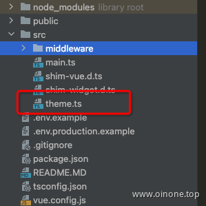
-
定义主题变量
在
theme.ts文件中定义主题名称和CSS变量,示例中将主色系替换为黑色。export const themeName = 'OinoneTheme'; export const themeCssVars = { 'primary-color': 'black', 'primary-color-hover': 'black', 'primary-color-rgb': '0, 0, 0', 'primary-color-focus': 'black', 'primary-color-active': 'black', 'primary-color-outline': 'black', }; -
在main.ts注册
import { registerTheme, VueOioProvider } from '@kunlun/dependencies'; // 引入注册主题组件
import { themeName, themeCssVars } from './theme'; // 引入theme.ts

registerTheme(themeName, themeCssVars);// 注册

VueOioProvider(
{
  ...other config
  theme: [themeName] // 定义的themeName传入provider中
},
[]
);
4: 刷新页面看效果
注意事项
- 确保在定义CSS变量时遵循主题设计规范。
- 正确引入theme.ts文件以避免编译错误。
总结
本文详细介绍了在Oinone平台中修改主题的两种方法:在线修改和代码修改。这些步骤允许开发者和用户根据个人喜好或项目需求,自定义界面的主题风格。
Oinone社区 作者:汤乾华原创文章,如若转载,请注明出处:https://doc.oinone.top/frontend/5774.html
访问Oinone官网:https://www.oinone.top获取数式Oinone低代码应用平台体验