
介绍
在日常的业务中,我们经常需要在表格内直接点击动作完成一些操作,而不是只能在操作栏中,例如:订单的表格内点击商品名称或者里面的按钮跳转到商品详情页面,这里我们将带来大家来通过自定义表格字段来实现这个功能。
1.编写表格字段组件
组件ts文件TableBtnFieldWidget.ts
import {
  ActionWidget,
  ActiveRecordExtendKeys,
  BaseFieldWidget,
  BaseListView,
  ModelFieldType,
  queryDslWidget,
  queryRowActionBar,
  RowContext,
  SPI,
  TableStringFieldWidget,
  BaseElementListViewWidget,
  ViewType,
  Widget
} from '@kunlun/dependencies';
import { createVNode, VNode } from 'vue';
import { toString } from 'lodash-es';
import TableBtnField from './TableBtnField.vue';

@SPI.ClassFactory(
  BaseFieldWidget.Token({
    viewType: ViewType.Table,
    ttype: [ModelFieldType.String, ModelFieldType.Text],
    // widget: 'StringLink',
    // 以下3行配置代码测试用,生产建议在界面设计器自定义组件,widget填自定义组件的api名称
    model: 'resource.k2.Model0000000109',
    name: 'name'
  })
)
export class TableBtnFieldWidget extends TableStringFieldWidget {
  @Widget.Reactive()
  private get triggerActionLabel() {
    // 界面设计器组件内设计该属性
    return this.getDsl().triggerActionLabel || '更新';
  }

  private getTriggerAction() {
    return this.model.modelActions.find((a) => a.label === this.triggerActionLabel);
  }

  private getTriggerActionWidget(widgetHandle: string, draftId: string, triggerActionLabel: string): ActionWidget | undefined {
    const listView = Widget.select(widgetHandle) as unknown as BaseListView;
    const listWidget = queryDslWidget(listView?.getChildrenInstance(), BaseElementListViewWidget);
    if (!listWidget) {
      return undefined;
    }
    const rowActionBar = queryRowActionBar(listWidget.getChildrenInstance(), draftId);
    const actionWidget = rowActionBar?.getChildrenInstance().find((a) => (a as ActionWidget).action.label === triggerActionLabel);
    return actionWidget as ActionWidget;
  }

  protected clickAction(context: RowContext) {
    const draftId = context.data[ActiveRecordExtendKeys.DRAFT_ID] as unknown as string;
    const actionWidget = this.getTriggerActionWidget(this.getRootHandle()!, draftId, this.triggerActionLabel);
    if (!actionWidget) {
      console.error('未找到action', this.triggerActionLabel);
      return;
    }
    actionWidget.click();
  }

  @Widget.Method()
  public renderDefaultSlot(context: RowContext): VNode[] | string {
    const value = toString(this.compute(context));
    if (value) {
      return [
        createVNode(TableBtnField, {
            value,
            triggerAction: this.getTriggerAction(),
            clickAction: () => this.clickAction(context)
          }
        )
      ];
    }
    return [];
  }
}
组件的vue文件TableBtnField.vue
这里的vue组件是将动作直接以按钮的形式展现,可以根据实际需要给字段内容包裹一个div后直接添加点击事件触发
clickAction方法
<template>
<span>
{{ value }}
</span>
<oio-button type="primary" size="small" @click="clickAction" v-if="triggerAction">{{ triggerAction.label || triggerAction.displayName }}</oio-button>
</template>
<script lang="ts">
import { defineComponent, PropType } from 'vue';
import { RuntimeAction } from '@kunlun/dependencies';
import { OioButton } from '@kunlun/vue-ui-antd';
export default defineComponent({
components: { OioButton },
props: { value: String, triggerAction: Object as PropType<RuntimeAction>, clickAction: Function },
setup(props) {
return {
};
}
});
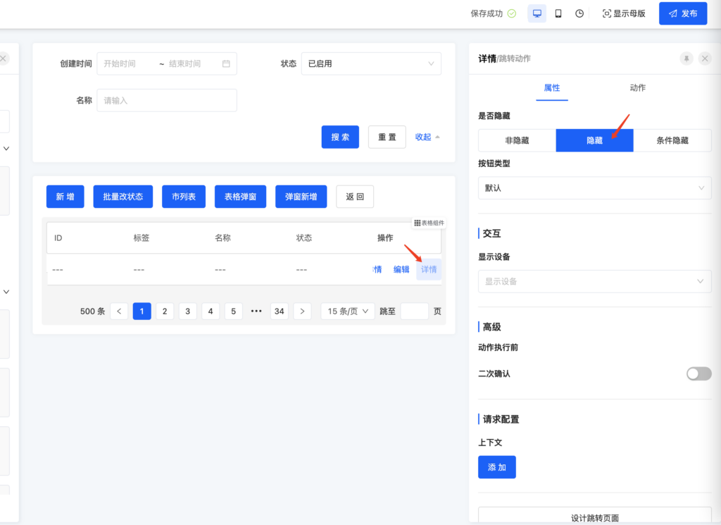
</script>2.在界面设计器的设计页面将需要在字段单元格展示的动作拖入到操作栏中,这样我们就可以在字段组件中拿到需要触发的动作的元数据。由于这个动作并不需要在操作栏真的展示,所以再将这个字段设置隐藏。
如果需要跳转到其他模型的页面,可以在动作的属性面板的上下文中配置参数,查看参考文档 页面跳转的时候如何增加跳转参数

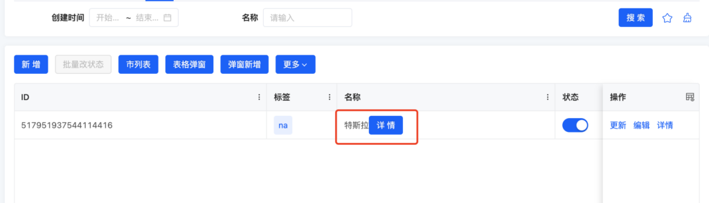
3.预览页面效果
Oinone社区 作者:nation原创文章,如若转载,请注明出处:https://doc.oinone.top/frontend/7263.html
访问Oinone官网:https://www.oinone.top获取数式Oinone低代码应用平台体验