
介绍
OinOne的表格是基于Vxe-Table实现的,我们将Vxe-table内置的关于单元格样式的方法、属性开放到了表格组件TableWidget上
Vxe-Table相关文档
单元格样式
行的样式、单元格样式,表头的样式、表尾的样式、全部都可以完全自定义,通过设置 cellClassName、headerCellClassName、rowClassName ...等参数
(注:当自定义样式之后可能会覆盖表格的样式,比如选中行..等,记得自行处理好相关样式)
单元格动态样式
行的动态样式、单元格动态样式,表头的动态样式、表尾的动态样式、可以通过设置 cellStyle、headerCellStyle、rowStyle ...等参数
(注:当自定义样式之后可能会覆盖表格的样式,比如选中行..等,记得自行处理好相关样式)
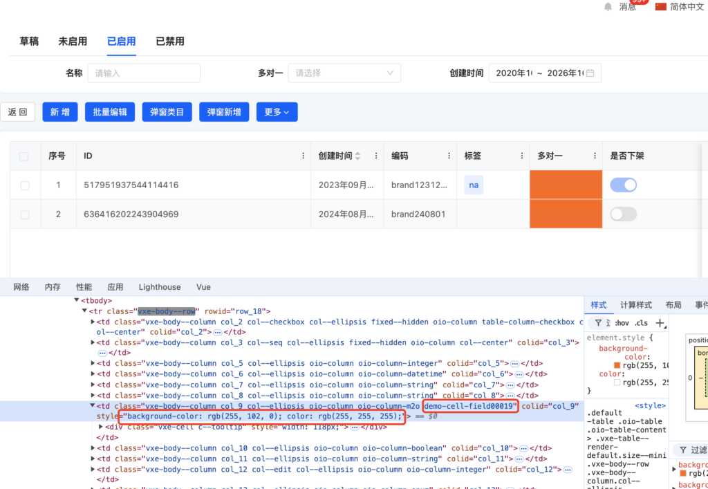
示例代码
这里仅演示cellClassName和cellStyle,其他方法的出入参数请参考上面的Vxe-Table文档
import { BaseElementWidget, SPI, TableWidget, ViewType, Widget } from '@kunlun/dependencies';

@SPI.ClassFactory(BaseElementWidget.Token({
  viewType: ViewType.Table,
  widget: 'CustomStyleTableWidget',
}))
export class CustomStyleTableWidget extends TableWidget {

  @Widget.Method()
  protected cellClassName({ row, rowIndex, $rowIndex, column, columnIndex, $columnIndex }) {
    if (column.field === 'field00019') {
      return `demo-cell-${column.field}`;
    }
    return '';
  }

  @Widget.Method()
  protected cellStyle({ row, rowIndex, $rowIndex, column, columnIndex, $columnIndex }) {
    if (column.field === 'field00019') {
      return {
        backgroundColor: '#f60',
        color: '#ffffff'
      };
    }
    return '';
  }
}
效果预览

Oinone社区 作者:nation原创文章,如若转载,请注明出处:https://doc.oinone.top/frontend/18749.html
访问Oinone官网:https://www.oinone.top获取数式Oinone低代码应用平台体验