
介绍
可以通过扩展TableWidget.ts实现
示例代码
import {
BaseElementWidget,
DslDefinitionType,
SPI,
TableWidget,
ViewType,
Widget
} from '@kunlun/dependencies';
@SPI.ClassFactory(
BaseElementWidget.Token({
type: ViewType.Table,
widget: 'table',
model: 'resource.k2.Model0000000109',
viewName: '移动端品牌_TABLE_0000000000021513'
})
)
export class FooterStatisticsTable extends TableWidget {
public initialize(props) {
if (props.template) {
props.template?.widgets?.forEach((a) => {
if (a.dslNodeType === DslDefinitionType.FIELD && this.statisticsFieldList.includes(a.name)) {
a.statistics = true;
}
});
}
super.initialize(props);
return this;
}
// 需要表尾做合并的字段名称
public statisticsFieldList = ['fansNum'];
@Widget.Reactive()
protected get showFooter(): boolean | undefined {
return true;
}
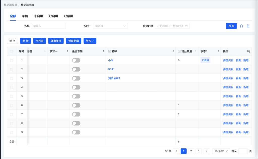
}效果预览

Oinone社区 作者:nation原创文章,如若转载,请注明出处:https://doc.oinone.top/frontend/17427.html
访问Oinone官网:https://www.oinone.top获取数式Oinone低代码应用平台体验