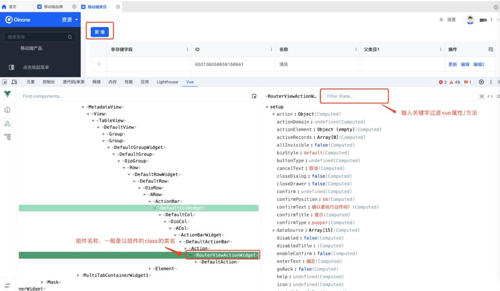
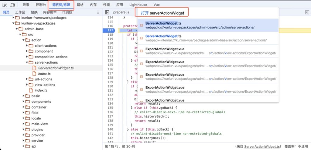
如何通过浏览器开发者工具提高调试效率

1.通过vue devtool查看vue组件和oinone组件的信息

如何通过浏览器开发者工具提高调试效率

平台字段、动作、视图组件都是以Widget结尾的,可以通过关键字快速找到组件

安装vue devtool插件

chrome安装最新版的vue devtool插件 谷歌应用商店插件地址,隐藏窗口需要在扩展程序的详情页额外设置才能使用该插件

安装好插件后,可以通过插件选中html页面中的元素查看相关信息

相关特性了解
  • 组件自动创建的vue组件以组件的class类名命名,据此特性可以得出自定义组件的时候,可继承该命名的父类
  • 一般oinone的组件以Widget后缀命名,也推荐大家也以此为后缀,方便在vue调试面板快速看出哪些是oinone组件
  • 选中oinone组件后可以在右侧面板看到相关的组件信息,部分属性介绍
    1. template属性为dsl的配置
    2. activeRecordsformDatarootDataparentDatadataSource等属性为常用数据属性
    3. action为动作的元数据
    4. field为字段的元数据

2.直接在浏览器开发者工具的源码处调试源码

打开浏览器开发者工具,进入标签页源代码/来源(英文版为Source),win系统用快捷键ctrl+O,mac系统用快捷键cmd+O, 可以打开文件搜索面板,通过关键字搜索文件名找到代码文件,可直接在里面debug调试或者查看执行逻辑
如何通过浏览器开发者工具提高调试效率

Oinone社区 作者:nation原创文章,如若转载,请注明出处:https://doc.oinone.top/frontend/17130.html

访问Oinone官网:https://www.oinone.top获取数式Oinone低代码应用平台体验

Like (0)
nation's avatarnation数式员工
Previous 2024年9月6日 pm8:36
Next 2024年9月10日 am9:30

相关推荐

  • 【前端】默认布局模板(v4)

    默认母版(Mask) PC端默认母版 <mask> <multi-tabs /> <header> <widget widget="app-switcher" /> <block> <widget widget="notification" /> <widget widget="divider" /> <widget widget="language" /> <widget widget="divider" /> <widget widget="user" /> </block> </header> <container> <sidebar> <widget widget="nav-menu" height="100%" /> </sidebar> <content> <breadcrumb /> <block width="100%"> <widget width="100%" widget="main-view" /> </block> </content> </container> </mask> PC端默认内联Tabs母版(<multi-tabs inline="true" />) <mask> <header> <widget widget="app-switcher" /> <block> <widget widget="notification" /> <widget widget="divider" /> <widget widget="language" /> <widget widget="divider" /> <widget widget="user" /> </block> </header> <container> <sidebar> <widget widget="nav-menu" height="100%" /> </sidebar> <block height="100%" flex="1 0 0" flexDirection="column" alignContent="flex-start" flexWrap="nowrap" overflow="hidden"> <multi-tabs inline="true" /> <content> <breadcrumb /> <block width="100%"> <widget width="100%" widget="main-view" /> </block> </content> </block> </container> </mask> 移动端默认母版 <mask> <widget widget="user" /> <widget widget="nav-menu" app-switcher="true" menu="true" /> <widget widget="main-view" height="100%" /> </mask> PC端默认布局(Layout) 表格视图(TABLE) <view type="TABLE"> <pack widget="group"> <view type="SEARCH"> <element widget="search" slot="search" /> </view> </pack> <pack widget="group" slot="tableGroup"> <element widget="actionBar" slot="actionBar"> <xslot name="actions" /> </element> <element widget="table" slot="table"> <element widget="expandColumn" slot="expandRow" /> <xslot name="fields" /> <element widget="rowActions" slot="rowActions" /> </element> </pack> </view> 表单视图(FORM) <view type="FORM"> <element widget="actionBar" slot="actionBar"> <xslot name="actions" /> </element> <element widget="form" slot="form"> <xslot name="fields" /> </element> </view>…

    2023年11月1日
    1.5K01
  • 动作API

    ActionWidget 动作组件的基类,包含了动作组件的通用属性和方法 示例 class MyActionWidget extends ActionWidget { } 动作属性 属性名 说明 类型 可选值 默认值 label 动作的名称 String – 当前动作的displayName action 当前动作的元数据 RuntimeAction – model 运行时模型 RuntimeModel – viewAction 运行时视图动作 RuntimeViewAction – view 运行时视图 RuntimeViewAction – initialValue 视图初始值 ActiveRecord[] – initialContext 视图初始上下文 Object – urlParameters 获取url参数 UrlQueryParameters – scene 场景 String – loading 动作加载状态 Boolean – false disabled 是否禁用 Boolean – false disabledTitle 禁用时的按钮名称 String – – invisible 当前字段是否不可见 Boolean – false validateForm 点击动作后是否校验表单 Boolean – false actionDomain 动作的domain查询条件 String – undefined goBack 点击动作后是否返回上一页 Boolean – false isDialog 是否为弹窗内动作 Boolean – 弹窗下的动作默认为true closeDialog 点击动作后是否关闭弹窗 Boolean – 默认为isDialog的值 isDrawer 是否为抽屉内动作 Boolean – 抽屉下的动作默认为true closeDrawer 点击动作后是否关闭抽屉 Boolean – 默认为isDrawer的值 isInnerPopup 是否为页内弹出层动作 Boolean – 页内弹出层下的动作默认为true isAsync 是否为异步动作 Boolean – true refreshRoot 是否刷新根视图 Boolean – false refreshData 是否刷新数据 Boolean – true type 动作的类型 ButtonType – 行内动作默认为ButtonType.link,其他动作为ButtonType.primary bizStyle 动作的业务类型 ButtonBizStyle – ButtonBizStyle.default icon 动作的图标 String – – enableConfirm 是否开启二次确认 Boolean – true confirmType 二次确认的类型 ConfirmType – – confirm 二次确认的内容 String – – confirmText 二次确认的提示内容 String – – confirmPosition 二次确认提示的展示位置 PopconfirmPlacement – PopconfirmPlacement.BM enterText 二次确认的确定按钮文字 String – – cancelText 二次确认的取消按钮文字 String – – searchBody 列表页的动作可以拿到搜索区域的搜索条件 ActiveRecord…

    2024年3月8日
    1.4K00
  • 【前端】登录页面扩展点

    登录页面扩展点 场景 1: 登录之前需要二次确认框2: 前端默认的错误提示允许被修改3: 后端返回的错误提示允许被修改4: 登录后跳转到自定义的页面 方案 前端默认错误可枚举 errorMessages: { loginEmpty: '用户名不能为空', passwordEmpty: '密码不能为空', picCodeEmpty: '图形验证码不能为空', phoneEmpty: '手机号不能为空', verificationCodeEmpty: '验证码不能为空', picCodeError: '图形验证码错误', inputVerificationCodeAlign: '请重新输入验证码' } 登录按钮添加拓展点beforeClick、afterClick 代码 新增一个ts文件,继承平台默认的LoginPageWidget @SPI.ClassFactory(RouterWidget.Token({ widget: 'Login' })) export class CustomLoginPageWidget extends LoginPageWidget { constructor() { super(); // 修改前端默认的错误文案 this.errorMessages.loginEmpty = '登录用户名不能为空'; } /** * 用来处理点击「登录」之前的事件,可以做二次确定或者其他的逻辑 * 只有return true,才会继续往下执行 */ public beforeClick(): Promise<Boolean | null | undefined> { return new Promise((resolve) => { Modal.confirm({ title: '提示', content: '是否登录?', onOk: () => { resolve(true); } }); }); } /** * * @param result 后端接口返回的数据 * * 用来处理「登录」接口调用后的逻辑,可以修改后端返回的错误文案,也可以自定义 * * 只有return true,才会执行默认的跳转事件 */ public afterClick(result): Promise<any | null | undefined> { // if(result.redirect) { // 自定义跳转 //return false //} if (result.errorCode === 20060023) { result.errorMsg = '手机号不对,请联系管理员'; } return result; } }

    2023年11月1日
    1.3K00
  • 弹窗生命周期实践

    在oinone平台中,弹窗、抽屉是用户界面设计中最为常见的,而对于开发者而言,能够监听弹窗的生命周期事件通常是十分重要的,因为它提供了一个机会去执行一些逻辑。在这篇文章中,我们将深入探讨如何监听弹窗、抽屉生命周期事件,并讨论一些可能的应用场景。 首先,我们来实现一个监听弹窗销毁的事件。 让我们看一下提供的代码片段: // 1: 自定义打开弹窗的动作 @SPI.ClassFactory( BaseActionWidget.Token({ actionType: [ActionType.View], target: [ViewActionTarget.Dialog], model: 'model', name: 'name' }) ) export class MyDialogViewActionWidget extends DialogViewActionWidget { protected subscribePopupDispose = (manager: IPopupManager, instance: IPopupInstance, action) => { // 自定义销毁弹窗后的逻辑 }; protected mounted() { PopupManager.INSTANCE.onDispose(this.subscribePopupDispose.bind(this)); } protected unmounted() { PopupManager.INSTANCE.clearOnDispose(this.subscribePopupDispose.bind(this)); } } 在上面的代码中,我们自定义了打开弹窗的动作,并且监听了弹窗销毁事件。 让我们逐步解析这段代码: 1: subscribePopupDispose 是一个函数,作为弹窗销毁事件的处理程序。它接收三个参数:manager、instance 和 action。 manager: 弹窗事件管理器 instance: 弹窗实例 action: 操作弹窗的动作,如果是点击弹窗右上角的关闭按钮,那action为null 2: 组件挂载的时候,进行监听. 4: 最后组件销毁的时候需要清除对应的监听 那么,如果监听到弹窗销毁,我们可以执行什么样的逻辑呢? 1: 更新相关组件状态: 弹窗销毁后,可能需要更新其他组件的状态。通过 popupWidget 可以获取到弹窗相关的信息,进而执行一些状态更新操作。 2: 处理弹窗销毁时的数据或动作: 在 subscribePopupDispose 函数中,action 参数含一些关于弹窗销毁时的动作信息,如果是点击弹窗右上角的销毁按钮,那action为null。我们可以根据这些信息执行相应的逻辑,例如更新界面状态、保存用户输入等 3: 触发其他操作: 弹窗销毁后,可能需要触发一些后续操作,比如显示另一个弹窗、发起网络请求等。 完整的生命周期 方法名 功能描述 onPush(fn) 监听 弹出窗口被推入时的事件处理器 clearOnPush(fn) 清除onPush事件的监听 onCreated(fn) 监听 弹出窗口创建时的事件处理器 clearOnCreated(fn) 清除onCreated事件的监听 onOpen(fn) 监听 弹出窗口打开时的事件处理器 clearOnOpen(fn) 清除onOpen事件的监听 onClose(fn) 监听 弹出窗口关闭时的事件处理器 clearOnClose(fn) 清除onClose事件的监听 onDispose(fn) 监听 弹出窗口被销毁时的事件处理器 clearOnDispose(fn) 清除onDispose事件的监听 onDisposeAll(fn) 监听 所有弹出窗口被销毁时的事件处理器 clearOnDisposeAll(fn) 清除onDisposeAll事件的监听 结语 开发者可以更灵活地响应用户操作,提升用户体验。在实际项目中,根据应用需求和设计,可以根据以上优化逻辑定制具体的处理流程。希望这篇文章为你提供了更深入的理解。

    2023年11月17日
    1.5K00
  • 表格主题配置(v4)

    TableThemeConfig /** * 表格主题配置 */ export interface TableThemeConfig { border: boolean | string; stripe: boolean; isCurrent: boolean; isHover: boolean; /** * 表格列主题配置 */ column: Partial<TableColumnThemeConfig>; } /** * 表格列主题配置 */ export interface TableColumnThemeConfig { /** * <h3>最小宽度</h3> * <ul> * <li>boolean: enabled column width auto compute</li> * <li>number: using css width (default: px)</li> * <li>string: using css width</li> * <li> * object: auto compute width for label by default function * <ul> * <li>min: min min width (default: 120)</li> * <li>max: max min width (default: 432)</li> * <li>chineseWidth: chinese width (default: 14 -> fontSize: 14px)</li> * <li>otherWidth: non chinese width (default: 9 -> fontSize: 14px)</li> * <li>sortableFixWidth: sortable handle width (default: 40)</li> * <li>nonSortableFixWidth: non sortable fix width (default: 22)</li> * </ul> * </li> * <li>function: auto compute width for label by function</li> * </ul> */ minWidth: boolean | number | string | Partial<TableColumnMinWidthComputeConfig> | TableColumnMinWidthComputeFunction; /** * 操作列 */ operation: { /** * 宽度 (default: 165) */ width?: number | string; /** * 最小宽度 (default: 120) */ minWidth?: number | string; }; } export interface TableColumnMinWidthComputeConfig { min: number;…

    2023年11月6日
    1.5K00

Leave a Reply

Please Login to Comment