
介绍
浏览器地址栏url为路由类型的视图动作(viewAction)的访问url
详情页示例url
https://one.oinone.top/page;module=resource;viewType=DETAIL;model=resource.ResourceDistrict;action=redirectDetailPage;scene=redirectDetailPage;target=ROUTER;menu=%7B%22selectedKeys%22:%5B%22%E5%8C%BA%22%5D,%22openKeys%22:%5B%22%E5%9C%B0%E5%9D%80%E5%BA%93%22,%22%E5%9C%B0%E5%8C%BA%22%5D%7D;id=575733837679260950;path=%2Fresource%2F%E5%8C%BA%2FACTION%23resource.ResourceDistrict%23redirectDetailPage
通过调试工具查看解析后的信息
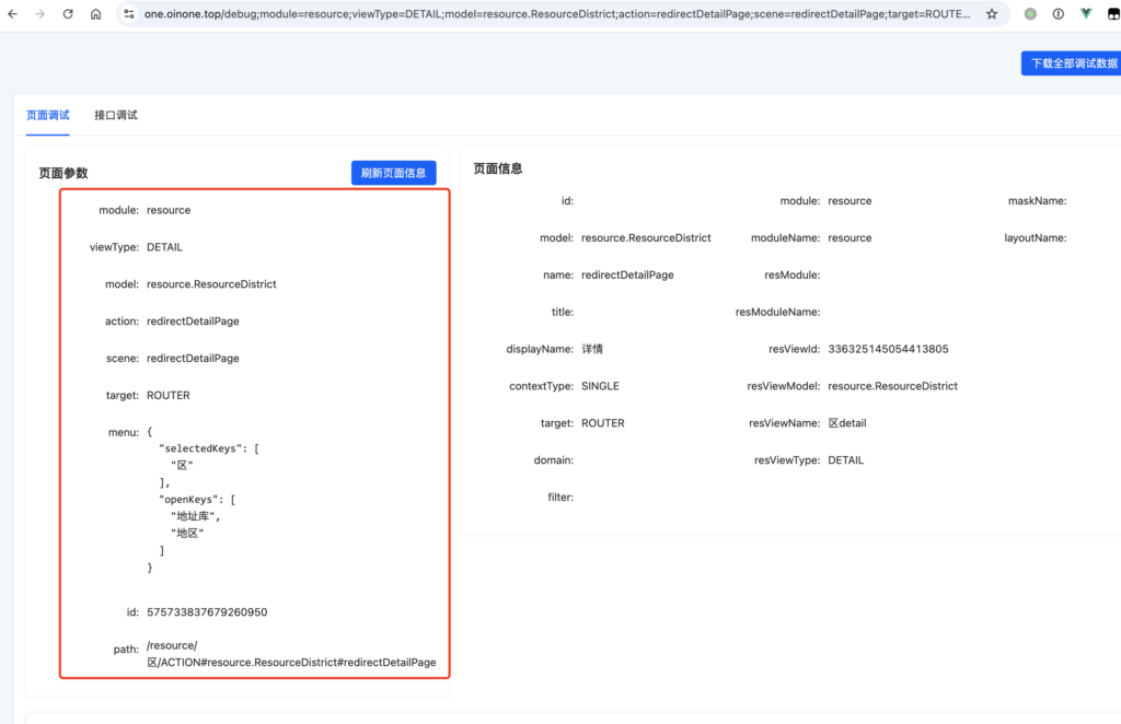

参数介绍
- module 动作所在模块名称
- viewType 视图类型
- model 动作所在模型的编码
- action 动作名称
- target 动作打开方式,ROUTER为当前路由打开,OPEN_WINDOW为新窗口打开
- menu 【选填】菜单栏控制参数,该参数不影响页面的业务逻辑,仅影响菜单栏展开哪些菜单项(通过openKeys属性),选中哪些菜单项(通过selectedKeys属性)),该参数经过
JSON.stringify(menu)方式处理过# 示例参数 { "selectedKeys": ["区"], "openKeys": ["地址库", "地区"] } - id 【选填】详情、编辑等单行数据页面的数据id
- searchBody 列表页搜索区域的搜索条件,该参数在前端经过
encodeURIComponent(JSON.stringify(searchBody))方式处理过# 示例参数 { "code": "11" } - searchConditions 列表页高级搜索条件,用于处理searchBody之外的复杂搜索条件,日常开发中无需关心该参数
encodeURIComponent(JSON.stringify(searchConditions))方式处理过# 示例参数 [ { "leftValue":["sourceType"], "operator":"==", "right":"GD" } ] -
context 上下文参数,该参数经过
JSON.stringify(menu)方式处理过列表页的此参数会填充到搜索区域的字段中作为默认的查询条件,详情详情页和表单页此参数会作为页面加载函数的入参
# 示例参数 { "cateId": "61723712399821" } - path 权限验证路径,父页面编译的时候自动加上该参数,在父页面点击当前动作的时候会自动拼该参数
- scene 【选填】动作场景值
代码中如何获取
这里介绍在组件内如何获取
import { BaseElementWidget } from '@kunlun/dependencies';

export class DemoElementWidget extends BaseElementWidget {
  protected test() {
    const { module, model, action } = this.urlParameters;
  }
}
推荐阅读相关文档
Oinone社区 作者:nation原创文章,如若转载,请注明出处:https://doc.oinone.top/frontend/16162.html
访问Oinone官网:https://www.oinone.top获取数式Oinone低代码应用平台体验