如何增加页面消息通知轮询的间隔或者关闭轮询

场景

oinone的前端页面默认自带了消息通知功能,在顶部状态栏可以看到消息的查看入口,默认每隔5秒查询一次最新的消息,我们可以通过自定义消息组件增加该间隔或者是关闭轮询
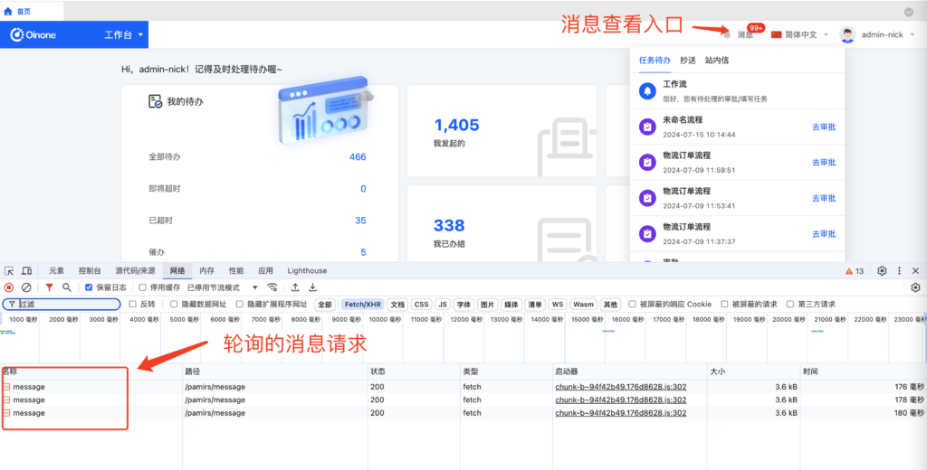
如何增加页面消息通知轮询的间隔或者关闭轮询

示例代码

修改轮询间隔
import { MaskWidget, NotificationWidget, SPI } from '@kunlun/dependencies';

@SPI.ClassFactory(MaskWidget.Token({ widget: 'notification' }))
export class DemoNotificationWidget extends NotificationWidget {

  /**
   * 轮询间隔时间,单位: 秒
   * @protected
   */
  protected msgDelay = 30000;
}
关闭轮询
import { MaskWidget, NotificationWidget, SPI } from '@kunlun/dependencies';

@SPI.ClassFactory(MaskWidget.Token({ widget: 'notification' }))
export class DemoNotificationWidget extends NotificationWidget {

  protected mounted() {
    super.mounted();
    // 清除轮询的定时器
    this.msgTimer && clearInterval(this.msgTimer);
    // 挂载后手动查询一次消息
    this.getMsgTotal();
  }
}

Oinone社区 作者:nation原创文章,如若转载,请注明出处:https://doc.oinone.top/frontend/16210.html

访问Oinone官网:https://www.oinone.top获取数式Oinone低代码应用平台体验

(0)
nation的头像nation数式员工
上一篇 2024年8月20日 am10:37
下一篇 2024年8月20日 pm8:22

相关推荐

  • oio-cascader 级联选择

    级联选择框。 何时使用 需要从一组相关联的数据集合进行选择,例如省市区,公司层级,事物分类等。 从一个较大的数据集合中进行选择时,用多级分类进行分隔,方便选择。 比起 Select 组件,可以在同一个浮层中完成选择,有较好的体验。 API <oio-cascader :options="options" v-model:value="value" /> 参数 说明 类型 默认值 Version allowClear 是否支持清除 boolean true autofocus 自动获取焦点 boolean false changeOnSelect (单选时生效)当此项为 true 时,点选每级菜单选项值都会发生变化,具体见上面的演示 boolean false disabled 禁用 boolean false displayRender 选择后展示的渲染函数,可使用 #displayRender="{labels, selectedOptions}" ({labels, selectedOptions}) => VNode labels => labels.join(' / ') dropdownClassName 自定义浮层类名 string – getTriggerContainer 菜单渲染父节点。默认渲染到 body 上,如果你遇到菜单滚动定位问题,试试修改为滚动的区域,并相对其定位。 Function(triggerNode) () => document.body loadData 用于动态加载选项,无法与 showSearch 一起使用 (selectedOptions) => void – maxTagCount 最多显示多少个 tag,响应式模式会对性能产生损耗 number | responsive – maxTagPlaceholder 隐藏 tag 时显示的内容 v-slot | function(omittedValues) – multiple 支持多选节点 boolean – options 可选项数据源 – placeholder 输入框占位文本 string ‘请选择’ searchValue 设置搜索的值,需要与 showSearch 配合使用 string – showSearch 在选择框中显示搜索框 boolean false tagRender 自定义 tag 内容,多选时生效 slot – value(v-model:value) 指定选中项 string[] | number[] – showSearch showSearch 为对象时,其中的字段: 参数 说明 类型 默认值 filterOption 接收 inputValue path 两个参数,当 path 符合筛选条件时,应返回 true,反之则返回 false。 function(inputValue, path): boolean 事件 事件名称 说明 回调参数 版本 change 选择完成后的回调 (value, selectedOptions) => void – search 监听搜索,返回输入的值 (value) => void – Option interface Option { value: string | number; label?: any; disabled?: boolean; children?: Option[]; // 标记是否为叶子节点,设置了 `loadData` 时有效 // 设为 `false` 时会强制标记为父节点,即使当前节点没有 children,也会显示展开图标 isLeaf?: boolean; }

    2023年12月18日
    1.3K00
  • 「前端」获取系统配置

    「前端」获取系统配置 简介 系统配置对于前端开发至关重要,它包含了许多关键信息,通过调用「systemMajorConfig」API,可以轻松地获取这些关键配置信息。除了主要的系统配置外,底层还提供了一些快捷的API,比如获取当前主题、当前主题大小、登录页面主题、版权状态和默认浏览器信息。 使用步骤 调用「systemMajorConfig」API获取系统配置数据。 使用返回的数据对象来访问特定的系统配置参数,如企业名称、企业官网等。 使用底层提供的快捷API来获取与系统配置相关的特定信息。 系统配置参数 logo (string): 应用logo(未折叠状态) appSideLogo (string): 应用logo(折叠状态) smallLogo (string): 小型logo slogan (string): 企业slogan favicon (string): 浏览器logo browserTitle (string): 浏览器标题 loginPageLogo (string): 登录页logo loginBackground (string): 登录页背景 loginLayoutType (any): 登录页布局主题 mode (any): 主题模式 size (string): 主题大小 快捷API列表 getCurrentTheme: 获取当前主题信息。 getCurrentThemeSize: 获取当前主题大小。 getLoginTheme: 获取登录页面主题信息。 getCopyrightStatus: 获取版权状态信息。 getDefaultBrowser: 获取默认浏览器信息。 示例代码 import { systemConfig, getCurrentTheme } from ‘@kunlun/dependencies’ // 访问特定系统配置参数 console.log(systemConfig.logo); // 输出企业名称 // 使用快捷API获取特定信息 console.log(getCurrentTheme());

    2023年11月1日
    1.2K00
  • 界面设计器 扩展字段的查询上下文

    默认情况下oinone平台对于查询条件,只提供的当前登录用户这一个配置,但是允许开发者扩展 开发者可以在前端代码的main.ts进行扩展 import { SessionContextOptions, ModelFieldType } from '@kunlun/dependencies'; const currentDeptOption = { ttype: ModelFieldType.String, value: '$#{currentDept}', displayName: '当前登录部门', label: '当前登录部门' }; SessionContextOptions.push(currentDeptOption as any); 加上上面的代码,然后再去界面设计器,我们就会发现,多了一个配置

    2023年11月8日
    2.0K00
  • 前端 SPI 注册 + 渲染

    在阅读本篇文章之前,您需要学习以下知识点: 1: TS 结合 Vue 实现动态注册和响应式管理 前端开发者在使用 oinone 平台的时候会发现,不管是自定义字段还是视图,对应的 typescript 都会用到@SPI.ClassFactory(参数),然后在对用的class中重写initialize方法`: @SPI.ClassFactory(参数) export class CustomClass extends xxx { public initialize(props) { super.initialize(props); this.setComponent(FormString); return this; } } 本文将带您熟悉 oinone 前端的 SPI 注册机制以及 TS + Vue 的渲染过程。 不管是自定义字段还是视图@SPI.ClassFactory(参数)都是固定写法,区别在于参数不同,这篇文章里面详细描述了参数的定义。 SPI 注册机制 有自定义过字段、视图经验的开发者可能会发现,字段(表单字段)SPI 注册用的是FormFieldWidget.Token生成对应的参数,视图 SPI 注册用的是BaseElementWidget.Token,那么为什么要这样定义呢? 大家可以想象成现在有一个大的房子,房子里面有很多房间,每个房间都有自己的名字,比如FormFieldWidget就是房间的名字,BaseElementWidget也是房间的名字,这样一来我们就可以根据不同的房间存放不同的东西。 下面给大家展示下伪代码实现: class SPI { static container = new Map<string, WeakMap<object, object>>() static ClassFactory(token) { return (target) => { if(!SPI.container.get(token.type)) { SPI.container.set(token.type, new WeakMap()) } const services = SPI.container.get(token.type) services?.set(token, target) } } } class FormFieldWidget { static Token(options) { return { …options, type: 'Field' } } static Selector(options) { const fieldWidgets = SPI.container.get('Field') if(fieldWidgets) { return fieldWidgets.get(options)! } return null } } @SPI.ClassFactory(FormFieldWidget.Token({ viewType: 'Form', ttype: 'String', widget: 'Input' })) class StringWidget { } // 字段元数据 const fieldMeta = { name: "name", field: "name", mode: 'demo.model', widget: 'Input', ttype: 'String', viewType: 'Form' } // 找到对应的widget const widget = FormFieldWidget.Selector({ viewType: fieldMeta.viewType, ttype: fieldMeta.ttype, widget: fieldMeta.widget, }) 在上述代码中,我们主要是做了这么写事情: 1.SPI class class SPI { static container = new Map<string, WeakMap<object, object>>() } SPI 类是一个静态类,用于管理服务的注册和获取。 container 是一个静态属性,类型是 Map,它的键是字符串,值是 WeakMap。这个结构允许我们为每个服务类型(例如,Field)管理多个服务实例。 2.ClassFactory 方法 static ClassFactory(token) { return (target) => { if…

    2024年9月26日
    1.7K00
  • 列表视图、卡片视图切换

    在日常项目开发中,我们可能会遇到当前视图是个表格,通过某个操作按钮将它变成卡片的形式. 这篇文章将带大家实现这种功能。通过上面两张图片可以看到出来不管是表格还是卡片,它都在当前的视图里面,所以我们需要一个视图容器来包裹表格跟卡片,并且表格可以使用平台默认的表格渲染,我们只需要自定义卡片即可。 我们用资源模块下面的国家菜单来实现这么一个功能这是对应的URL: http://localhost:8080/page;module=resource;viewType=TABLE;model=resource.ResourceCountry;action=resource%23%E5%9B%BD%E5%AE%B6;scene=resource%23%E5%9B%BD%E5%AE%B6;target=OPEN_WINDOW;menu=%7B%22selectedKeys%22:%5B%22%E5%9B%BD%E5%AE%B6%22%5D,%22openKeys%22:%5B%22%E5%9C%B0%E5%9D%80%E5%BA%93%22,%22%E5%9C%B0%E5%8C%BA%22%5D%7D 源码下载 views 创建外层的视图容器 刚刚我们讲过,不管是表格还是卡片,它都在当前的视图里面,所以我们需要写一个视图容器来包裹它们,并且对应的容器里面允许拆入表格跟卡片,我们先创建TableWithCardViewWidget.ts // TableWithCardViewWidget.ts import { BaseElementWidget, SPI, Widget } from '@kunlun/dependencies'; import TableWithCardView from './TableWithCardView.vue'; enum ListViewType { TABLE = 'table', CARD = 'card' } @SPI.ClassFactory( BaseElementWidget.Token({ widget: 'TableWithCardViewWidget' }) ) export class TableWithCardViewWidget extends BaseElementWidget { @Widget.Reactive() private listViewType: ListViewType = ListViewType.TABLE; // 当前视图展示的类型,是展示卡片还是表格 public initialize(props) { if (!props.slotNames) { props.slotNames = ['tableWidget', 'cardWidget']; } super.initialize(props); this.setComponent(TableWithCardView); return this; } } 在TableWithCardViewWidget中的initialize函数中,我们定义了两个插槽: tableWidget、cardWidget,所以需要在对应的vue文件里面里接收这两个插槽 <template> <div class="list-view-wrapper"> <!– 表格插槽 –> <div style="height: 100%" v-if="listViewType === 'table'"> <slot name="tableWidget" /> </div> <!– 卡片插槽 –> <div v-if="listViewType === 'card'"> <slot name="cardWidget"></slot> </div> </div> </template> <script lang="ts"> import { defineComponent } from 'vue'; export default defineComponent({ props: ['listViewType', 'onChangeViewType'], inheritAttrs: false, setup(props, context) { const onChangeViewType = (listViewType) => { props.onChangeViewType(listViewType); }; } }); </script> 这样一来,我们就定义好了视图容器,接下来就是通过自定义layout的方式注册该容器 layout注册 import { registerLayout, ViewType } from '@kunlun/dependencies'; registerLayout( `<view type="TABLE"> <pack widget="group"> <view type="SEARCH"> <element widget="search" cols="4" slot="search"/> </view> </pack> <pack widget="group" slot="tableGroup" style="position: relative"> <element widget="actionBar" slot="actionBar" slotSupport="action"> <xslot name="actions" slotSupport="action" /> </element> <element widget="TableWithCardViewWidget"> <template slot="tableWidget"> <element widget="table" slot="table" datasource-provider="true"> <element widget="expandColumn" slot="expandRow" /> <xslot name="fields" />…

    2024年10月16日
    2.3K01

Leave a Reply

登录后才能评论