自定义字段组件如何处理vue组件内的表单校验

介绍

本示例以字符串字段为业务场景,将输入框用element-plus的组件实现了一遍,vue组件内在onMounted生命周期内将ElForm表单实例通过ts组件内提供到propssetFormInstance方法设置到了ts组件的属性formInstance上,这样就可以在ts组件校验方法validator()触发的时候直接调用表单组件实例formInstance的校验方法validate()

适用场景
  1. 当前字段存储了动态表单的配置json,vue组件内自行实现了一套表单渲染逻辑,需要在vue组件和ts组件内同时触发校验
参考文档
示例代码

ts组件

import {
  BaseFieldWidget,
  FormStringFieldSingleWidget,
  isValidatorSuccess,
  ModelFieldType,
  SPI,
  ValidatorInfo,
  ViewType,
  Widget
} from '@kunlun/dependencies';
import { FormInstance } from 'element-plus';
import MyFormStringField from './MyFormStringField.vue';

@SPI.ClassFactory(
  BaseFieldWidget.Token({
    viewType: [ViewType.Form, ViewType.Search],
    ttype: ModelFieldType.String,
    widget: 'Input',
    model: 'resource.k2.Model0000000109',
    name: 'code',
  })
)
export class MyFormStringFieldWidget extends FormStringFieldSingleWidget {

  public initialize(props) {
    super.initialize(props);
    this.setComponent(MyFormStringField);
    return this;
  }

  /**
   * ElementPlus的表单vue组件实例
   * @private
   */
  private formInstance?: FormInstance;

  @Widget.Method()
  private setFormInstance(formInstance: FormInstance | undefined) {
    this.formInstance = formInstance;
  }

  /**
   * 字段校验方法
   */
  public async validator(): Promise<ValidatorInfo> {
    const validRes = await this.formInstance?.validate((valid, fields) => {});
    console.log('validRes', validRes)
    if (!validRes) {
      return this.validatorError('校验失败');
    }

    const res = await super.validator();
    if (!isValidatorSuccess(res)) {
      return res;
    }
    if (this.value == null) {
      return this.validatorSuccess();
    }
    return this.validateLength(this.value);
  }

}

vue组件

<template>
  <ElForm ref="formInstance" :model="model" :rules="rules">
    <ElFormItem label="编码" prop="code">
      <ElInput v-model="model.code" @input="onValueChange"></ElInput>
    </ElFormItem>
  </ElForm>
</template>
<script lang="ts">
import { defineComponent, reactive, ref, onMounted, watch } from 'vue';
import { ElForm, ElFormItem, ElInput, FormInstance } from 'element-plus';

export default defineComponent({
  name: 'MyFormStringField',
  components: {
    ElForm,
    ElFormItem,
    ElInput
  },
  props: ['value', 'setFormInstance', 'onChange'],
  setup(props) {
    const formInstance = ref<FormInstance>();
    const model = ref({ code: '' });

    const rules = reactive({
      code: [
        { required: true, message: '必填', trigger: 'blur' },
      ]
    });

    function onValueChange() {
      props.onChange?.(model.value.code);
    }

    onMounted(() => {
      props.setFormInstance?.(formInstance.value);
    });

    watch(props.value, () => {
      model.value.code = props.value;
    });

    return {
      formInstance,
      model,
      rules,
      onValueChange
    }
  }
});
</script>

页面校验效果查看
自定义字段组件如何处理vue组件内的表单校验

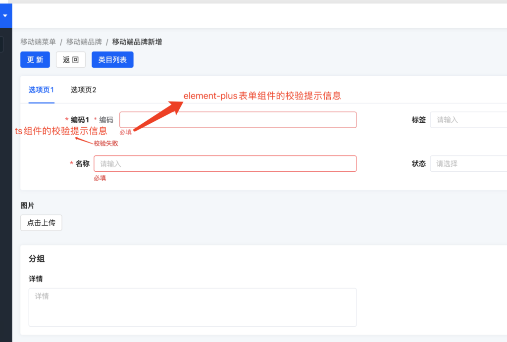
Oinone社区 作者:nation原创文章,如若转载,请注明出处:https://doc.oinone.top/frontend/17094.html

访问Oinone官网:https://www.oinone.top获取数式Oinone低代码应用平台体验

Like (0)
nation's avatarnation数式员工
Previous 2024年9月6日 am11:38
Next 2024年9月6日 pm8:36

相关推荐

  • 前端-如何修改指定页面的内组件的css样式

    为组件加自定义class,用该class作为父选择器写特定的css样式 以form为例,自定义了以下class <view/>标签的表单视图(FormView)组件 <element/>标签的form(FormWidget)组件 <element/>标签的actionBar(ActionBarWidget)组件 import { registerLayout, ViewType } from '@kunlun/dependencies'; export const install = () => { registerLayout( ` <view type="FORM" class="my-form-view"> <element widget="form" slot="form" class="my-form-widget"> <xslot name="fields" slotSupport="pack,field" /> </element> <element widget="actionBar" slot="actionBar" class="my-action-bar" slotSupport="action" > <xslot name="actions" slotSupport="action" /> </element> </view> `, { viewType: ViewType.Form, model: 'resource.k2.Model0000000109', actionName: 'uiViewb2de116be1754ff781e1ffa8065477fa' } ); }; install(); 查看修改后的页面html结构 编写样式的css .my-form-view .oio-form { /** TODO **/ } .my-form-widget .oio-row { /** TODO **/ } .my-action-bar .oio-col { /** TODO **/ }

    2024年6月17日
    1.5K00
  • TS 结合 Vue 实现动态注册和响应式管理

    基础知识 1: 面向对象 面向对象编程是 JavaScript 中一种重要的编程范式,它帮助开发者通过类和对象组织代码,提高代码的复用性。 2: 装饰器 装饰器在 JavaScript 中是用于包装 class 或方法的高阶函数 为了统一术语,下面的内容会把装饰器讲成注解 在 oinone 平台中,无论是字段还是动作,都是通过 ts + vue 来实现的,ts 中是面向对象的写法,所有的属性、方法建议都在对应的 class 中,如果有通用的属性跟方法,可以放在一个公共的 class 中,然后通过继承来实现,这样便于维护。 <!– FormString.vue –> <template> <div> <p>用户名: {{userName}}</p> <button @click="updateUser({name: '王五'})">修改用户名</button> </div> </template> <script lang="ts"> import { defineComponent } from 'vue'; export default defineComponent({ props: { userName: { type: String, default: '' }, userInfo: { type: Object, default: () => ({}) }, updateUser: { type: Function, default: () => () => ({}) } } }); </script> import FormString from './FormString.vue' @SPI.ClassFactory( FormFieldWidget.Token({ viewType: [ViewType.Form, ViewType.Search], ttype: ModelFieldType.String }) ) export class FormCustomStringFieldWidget extends FormFieldWidget { public initialize(props) { super.initialize(props); // 调用父类方法,确保继承的属性和方法正常初始化 this.setComponent(FormString); // 注册 Vue 组件,这样该 Widget 就会渲染 FormString 组件 return this; } public otherInfo = { name:'张三' } @Widget.Reactive() public userInfo = { name:'李四' } @Widget.Reactive() public get userName() { return this.userInfo.name } @Widget.Method() public updateUser userName(user) { this.userInfo = user } public updateOtherUser userName(user) { this.otherUser = user } } 这段代码定义了一个 FormCustomStringFieldWidget 类,用于处理表单中 String 类型字段的展示和交互。该类继承自 FormFieldWidget,并使用了多种注解和特性来实现不同功能。下面是对代码的详细讲解。 SPI 讲解 @SPI.ClassFactory() 无论是自定义字段还是动作,或者是自定义 mask、layout,都会用到@SPI.ClassFactory来注册,@SPI.ClassFactory 是一个注解,它标记了该类是通过工厂模式注册的。 在前端中,所有的注解(装饰器)本质上还是高阶函数,下面是一段伪代码。 const SPI = { ClassFactory(token) { return (targetClass) => {…

    2024年9月21日
    2.0K00
  • Class Component(ts)(v4)

    Class Component 一种使用typescript的class声明组件的方式。 IWidget类型声明 IWidget是平台内所有组件的统一接口定义,也是一个组件定义的最小集。 /** * 组件构造器 */ export type WidgetConstructor<Props extends WidgetProps, Widget extends IWidget<Props>> = Constructor<Widget>; /** * 组件属性 */ export interface WidgetProps { [key: string]: unknown; } /** * 组件 */ export interface IWidget<Props extends WidgetProps = WidgetProps> extends DisposableSupported { /** * 获取当前组件响应式对象 * @return this */ getOperator(); /** * 组件初始化 * @param props 属性 */ initialize(props: Props); /** * 创建子组件 * @param constructor 子组件构造器 * @param slotName 插槽名称 * @param props 属性 * @param specifiedIndex 插入/替换指定索引的子组件 */ createWidget<ChildProps extends WidgetProps = WidgetProps>( constructor: WidgetConstructor<ChildProps, IWidget<ChildProps>>, slotName?: string, props?: ChildProps, specifiedIndex?: number ); } Widget Widget是平台实现的类似于Class Component组件抽象基类,定义了包括渲染、生命周期、provider/inject、watch等相关功能。 export abstract class Widget<Props extends WidgetProps = WidgetProps, R = unknown> implements IWidget<Props> { /** * 添加事件监听 * * @param {string} path 监听的路径 * @param {deep?:boolean;immediate?:boolean} options? * * @example * * @Widget.Watch('formData.name', {deep: true, immediate: true}) * private watchName(name: string) { * … todo * } * */ protected static Watch(path: string, options?: { deep?: boolean; immediate?: boolean }); /** * 可以用来处理不同widget之间的通讯,当被订阅的时候,会将默认值发送出去 * * @param {Symbol} name 唯一标示 * @param {unknown} value? 默认值 * * @example *…

    2023年11月1日
    1.6K00
  • 【前端】工程结构最佳实践(v4)

    阅读之前 你应该: 了解node与npm相关内容 了解lerna包管理工具的相关内容 官方文档 了解git仓库的相关内容 了解rollup的相关内容 工程结构包示例 Vue项目结构包下载 工程结构详解 工程结构 ├── packages │   ├── kunlun-boot │   │   ├── package.json │   │   ├── public │   │   │   ├── favicon.ico │   │   │   └── index.html │   │   ├── src │   │   │   ├── main.ts │   │   │   └── shim-vue.d.ts │   │   ├── tsconfig.json │   │   └── vue.config.js │   ├── kunlun-module-demo │   │   ├── scripts │   │   │   ├── postpublish.js │   │   │   └── prepublish-only.js │   │   ├── src │   │   │   ├── index.ts │   │   │   └── shim-vue.d.ts │   │   ├── index.ts │   │   ├── package.json │   │   ├── rollup.config.js │   │   └── tsconfig.json │   └── kunlun-modules-demo │   ├── scripts │   │   ├── build.config.js │   │   ├── postpublish.js │   │   └── prepublish-only.js │   ├── packages │   │   ├── module-demo1 │   │   │   ├── index.ts │   │   │   ├── package.json │   │   │   ├── rollup.config.js │   │   │   └── src │   │   │   ├── index.ts │   │   │   └── shim-vue.d.ts │   │   ├── module-demo2 │   │   │   ├── index.ts │   │   │   ├── package.json │   │   │   ├── rollup.config.js │   │   │  …

    前端 2023年11月1日
    1.5K00
  • oio-cascader 级联选择

    级联选择框。 何时使用 需要从一组相关联的数据集合进行选择,例如省市区,公司层级,事物分类等。 从一个较大的数据集合中进行选择时,用多级分类进行分隔,方便选择。 比起 Select 组件,可以在同一个浮层中完成选择,有较好的体验。 API <oio-cascader :options="options" v-model:value="value" /> 参数 说明 类型 默认值 Version allowClear 是否支持清除 boolean true autofocus 自动获取焦点 boolean false changeOnSelect (单选时生效)当此项为 true 时,点选每级菜单选项值都会发生变化,具体见上面的演示 boolean false disabled 禁用 boolean false displayRender 选择后展示的渲染函数,可使用 #displayRender="{labels, selectedOptions}" ({labels, selectedOptions}) => VNode labels => labels.join(' / ') dropdownClassName 自定义浮层类名 string – getTriggerContainer 菜单渲染父节点。默认渲染到 body 上,如果你遇到菜单滚动定位问题,试试修改为滚动的区域,并相对其定位。 Function(triggerNode) () => document.body loadData 用于动态加载选项,无法与 showSearch 一起使用 (selectedOptions) => void – maxTagCount 最多显示多少个 tag,响应式模式会对性能产生损耗 number | responsive – maxTagPlaceholder 隐藏 tag 时显示的内容 v-slot | function(omittedValues) – multiple 支持多选节点 boolean – options 可选项数据源 – placeholder 输入框占位文本 string ‘请选择’ searchValue 设置搜索的值,需要与 showSearch 配合使用 string – showSearch 在选择框中显示搜索框 boolean false tagRender 自定义 tag 内容,多选时生效 slot – value(v-model:value) 指定选中项 string[] | number[] – showSearch showSearch 为对象时,其中的字段: 参数 说明 类型 默认值 filterOption 接收 inputValue path 两个参数,当 path 符合筛选条件时,应返回 true,反之则返回 false。 function(inputValue, path): boolean 事件 事件名称 说明 回调参数 版本 change 选择完成后的回调 (value, selectedOptions) => void – search 监听搜索,返回输入的值 (value) => void – Option interface Option { value: string | number; label?: any; disabled?: boolean; children?: Option[]; // 标记是否为叶子节点,设置了 `loadData` 时有效 // 设为 `false` 时会强制标记为父节点,即使当前节点没有 children,也会显示展开图标 isLeaf?: boolean; }

    2023年12月18日
    1.4K00

Leave a Reply

Please Login to Comment