
介绍
oinone的pc端的页面默认都可以在移动端直接访问。自定义mask、layout、视图组件、字段组件、动作组件方式都参考pc端实现。目前移动端的UI组件是基于vant@3.6.0版本开发,如有自定义部分的代码,推荐使用该组件库。
“注意”: 由于移动端和pc端在交互上的巨大差异,两端用的是不同的UI组件库是,按照此约定开发的自定义组件在两端也是无法相互兼容的,在pc端自定义的组件或者页面,不会在移动端自动适配,需要自行开发对应的移动端组件或者页面。
工程搭建
移动端很多交互跟pc端差异很大,所以移动端的我们采用的方案是独立用一套移动端的UI框架实现,而不是简单的做页面布局自适应,所以移动端需要跟pc端一样独立部署一套前端工程。
如何区分多端
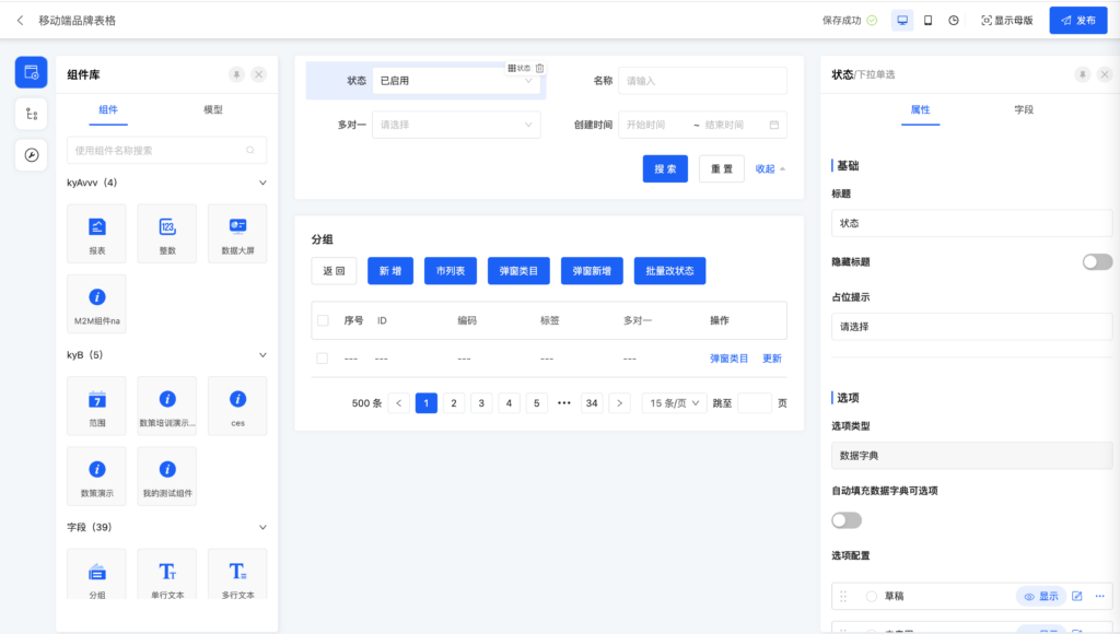
在界面设计器设计页面的时候,可以通过顶部的多端设备的图标切换在各端的页面效果。
pc端页面

切换为移动端后的页面
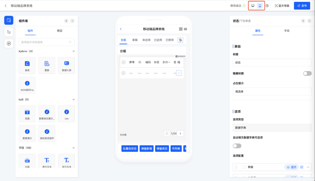
注意:大部分情况下,pc端和移动端可以共享一个设计的页面,然后通过上面的方法区分两端,如果移动端的页面交互差异很大,那更推荐独立新建一个页面专门给移动端使用。
模块
模块在定义的时候可以通过注解@Module.clientTypes决定当前模块在哪些端展示
package pro.shushi.pamirs.demo.api;

import org.springframework.stereotype.Component;
import pro.shushi.pamirs.business.api.BusinessModule;
import pro.shushi.pamirs.core.common.CommonModule;
import pro.shushi.pamirs.file.api.FileModule;
import pro.shushi.pamirs.meta.annotation.Module;
import pro.shushi.pamirs.meta.base.PamirsModule;
import pro.shushi.pamirs.meta.common.constants.ModuleConstants;
import pro.shushi.pamirs.meta.enmu.ClientTypeEnum;
import pro.shushi.pamirs.user.api.UserModule;

@Component
@Module(
        name = DemoModule.MODULE_NAME,
        displayName = "oinoneDemo工程",
        version = "1.0.0",
        // 客户端类型,默认是PC和MOBILE端都展示
        clientTypes =  {ClientTypeEnum.PC, ClientTypeEnum.MOBILE},
        // 登录后默认访问 priority 值最小的模块
        priority = 1,
        dependencies = {ModuleConstants.MODULE_BASE,
                CommonModule.MODULE_MODULE,
                UserModule.MODULE_MODULE,
                BusinessModule.MODULE_MODULE,
                FileModule.MODULE_MODULE
        }
)
@Module.module(DemoModule.MODULE_MODULE)
@Module.Advanced(selfBuilt = true, application = true)
public class DemoModule implements PamirsModule {

    public static final String MODULE_MODULE = "demo_core";

    public static final String MODULE_NAME = "DemoCore";

    @Override
    public String[] packagePrefix() {
        return new String[]{
                "pro.shushi.pamirs.demo"
        };
    }
}
菜单
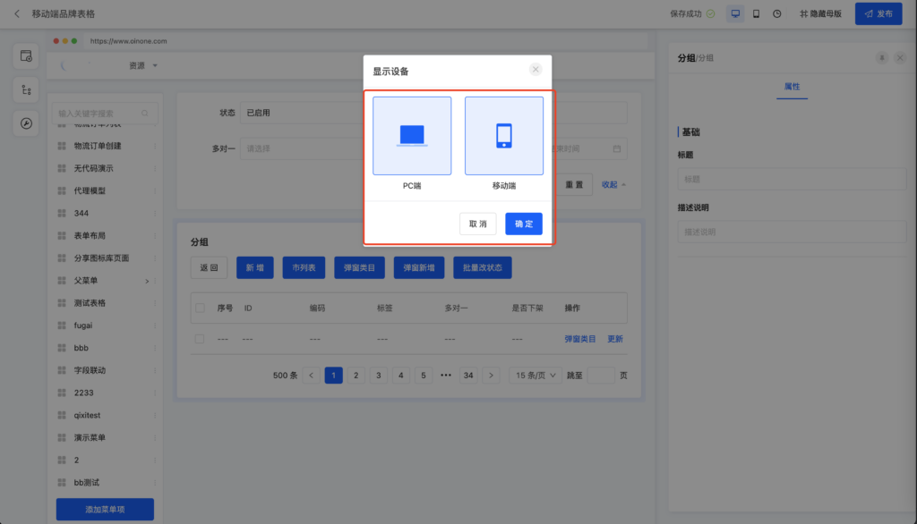
界面设计器设置方式
在菜单设置的时候可以选择“显示设备”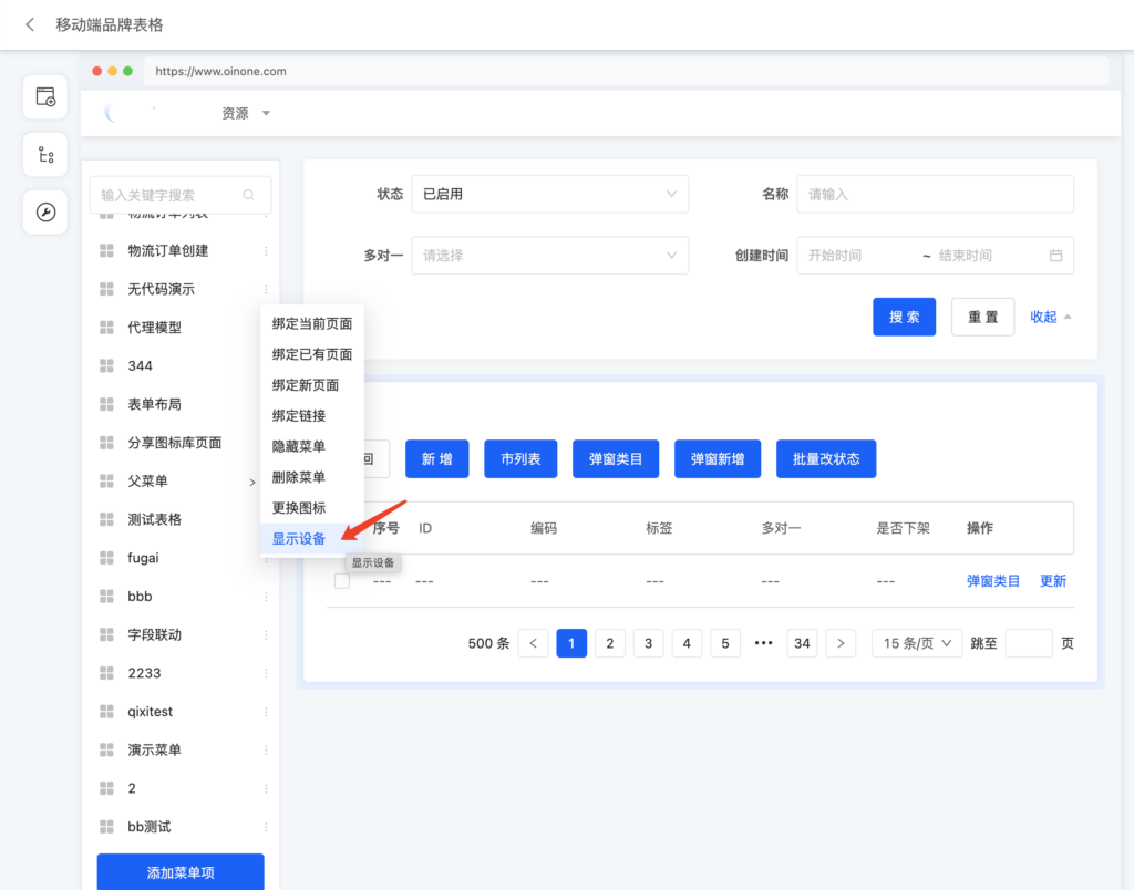
低代码设置方式
通过注解@UxMenu.clientTypes设置显示设备
package pro.shushi.pamirs.demo.core.init.menu;

import pro.shushi.pamirs.boot.base.constants.ViewActionConstants;
import pro.shushi.pamirs.boot.base.ux.annotation.action.UxRoute;
import pro.shushi.pamirs.boot.base.ux.annotation.navigator.UxMenu;
import pro.shushi.pamirs.boot.base.ux.annotation.navigator.UxMenus;
import pro.shushi.pamirs.demo.api.model.DemoItem;
import pro.shushi.pamirs.demo.api.model.DemoItemCategory;
import pro.shushi.pamirs.meta.enmu.ClientTypeEnum;

@UxMenus()
public class DemoMenus implements ViewActionConstants {

    // 同时在pc端和移动端显示
    @UxMenu(value = "商品中心", clientTypes = {ClientTypeEnum.PC, ClientTypeEnum.MOBILE})
    class ItemPMenu{
        @UxMenu("商品类目") class DemoItemAndCateMenu {
            // 只在pc端显示
            @UxMenu(value = "商品管理", clientTypes = {ClientTypeEnum.PC})
            @UxRoute(DemoItem.MODEL_MODEL)
            class DemoItemMenu {
            }

            // 只在移动端显示
            @UxMenu(value = "类目管理", clientTypes = {ClientTypeEnum.MOBILE})
            @UxRoute(DemoItemCategory.MODEL_MODEL)
            class DemoItemCategoryMenu {
            }
        }

    }
}
组件
界面设计器选中组件后,可以在右边属性面板看到“显示设备”的配置,默认为空,为空则表示在pc端和移动端都显示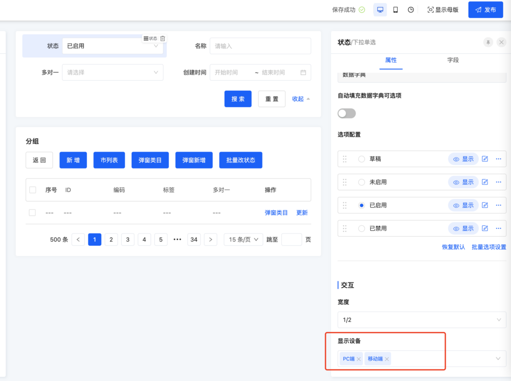
Oinone社区 作者:nation原创文章,如若转载,请注明出处:https://doc.oinone.top/frontend/17458.html
访问Oinone官网:https://www.oinone.top获取数式Oinone低代码应用平台体验