列表视图、卡片视图切换

在日常项目开发中,我们可能会遇到当前视图是个表格,通过某个操作按钮将它变成卡片的形式.
列表视图、卡片视图切换
列表视图、卡片视图切换

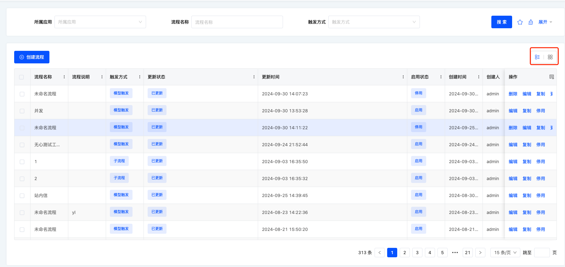
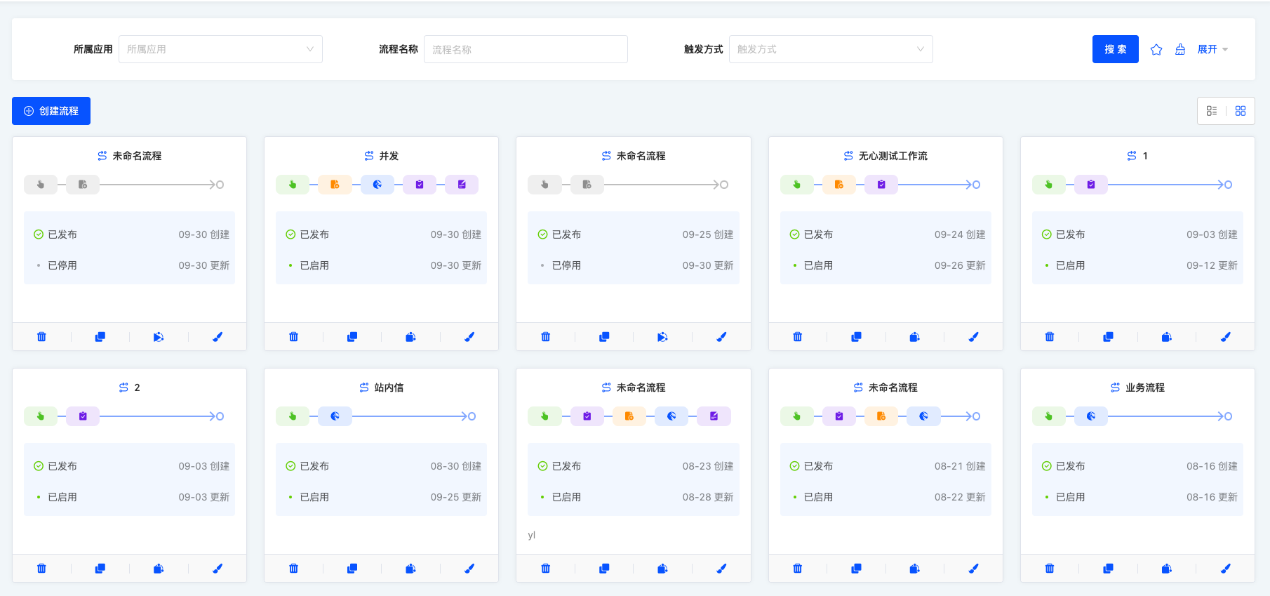
这篇文章将带大家实现这种功能。通过上面两张图片可以看到出来不管是表格还是卡片,它都在当前的视图里面,所以我们需要一个视图容器来包裹表格卡片,并且表格可以使用平台默认的表格渲染,我们只需要自定义卡片即可。

我们用资源模块下面的国家菜单来实现这么一个功能这是对应的URL:

http://localhost:8080/page;module=resource;viewType=TABLE;model=resource.ResourceCountry;action=resource%23%E5%9B%BD%E5%AE%B6;scene=resource%23%E5%9B%BD%E5%AE%B6;target=OPEN_WINDOW;menu=%7B%22selectedKeys%22:%5B%22%E5%9B%BD%E5%AE%B6%22%5D,%22openKeys%22:%5B%22%E5%9C%B0%E5%9D%80%E5%BA%93%22,%22%E5%9C%B0%E5%8C%BA%22%5D%7D

源码下载

views

创建外层的视图容器

刚刚我们讲过,不管是表格还是卡片,它都在当前的视图里面,所以我们需要写一个视图容器来包裹它们,并且对应的容器里面允许拆入表格卡片,我们先创建TableWithCardViewWidget.ts

// TableWithCardViewWidget.ts 
import { BaseElementWidget, SPI, Widget } from '@kunlun/dependencies';
import TableWithCardView from './TableWithCardView.vue';

enum ListViewType {
  TABLE = 'table',
  CARD = 'card'
}

@SPI.ClassFactory(
  BaseElementWidget.Token({
    widget: 'TableWithCardViewWidget'
  })
)
export class TableWithCardViewWidget extends BaseElementWidget {
  @Widget.Reactive()
  private listViewType: ListViewType = ListViewType.TABLE; // 当前视图展示的类型,是展示卡片还是表格

  public initialize(props) {
    if (!props.slotNames) {
      props.slotNames = ['tableWidget', 'cardWidget'];
    }
    super.initialize(props);
    this.setComponent(TableWithCardView);

    return this;
  }
}

TableWithCardViewWidget中的initialize函数中,我们定义了两个插槽: tableWidget、cardWidget,所以需要在对应的vue文件里面里接收这两个插槽

<template>
  <div class="list-view-wrapper">
    <!-- 表格插槽 -->
    <div style="height: 100%" v-if="listViewType === 'table'">
      <slot name="tableWidget" />
    </div>

    <!-- 卡片插槽 -->
    <div v-if="listViewType === 'card'">
      <slot name="cardWidget"></slot>
    </div>
  </div>
</template>

<script lang="ts">
import { defineComponent } from 'vue';

export default defineComponent({
  props: ['listViewType', 'onChangeViewType'],
  inheritAttrs: false,
  setup(props, context) {
    const onChangeViewType = (listViewType) => {
      props.onChangeViewType(listViewType);
    };
  }
});
</script>

这样一来,我们就定义好了视图容器,接下来就是通过自定义layout的方式注册该容器

layout注册

import { registerLayout, ViewType } from '@kunlun/dependencies';

registerLayout(
  `<view type="TABLE">
    <pack widget="group">
        <view type="SEARCH">
            <element widget="search" cols="4" slot="search"/>
        </view>
    </pack>
    <pack widget="group" slot="tableGroup" style="position: relative">
      <element widget="actionBar" slot="actionBar" slotSupport="action">
        <xslot name="actions" slotSupport="action" />
      </element>
      <element widget="TableWithCardViewWidget">
        <template slot="tableWidget">
          <element widget="table" slot="table" datasource-provider="true">
            <element widget="expandColumn" slot="expandRow" />
            <xslot name="fields" />
            <element widget="rowActions" slot="rowActions" />
          </element>
        </template>
        <template slot="cardWidget">
          <element widget="CardListViewWidget" datasource-provider="true" />
        </template>
      </element>
    </pack>
  </view>
`,
  {
    moduleName: 'resource.ResourceCountry',
    actionName: 'resource#国家',
    viewType: ViewType.Table
  }
);

这个layout是基于平台默认的table layout改造的,大家可以看到

      <element widget="TableWithCardViewWidget">
        <template slot="tableWidget">
          ...
        </template>
        <template slot="cardWidget">
             ...
        </template>
      </element>

这段模版是将自定义的视图容器TableWithCardViewWidget注册进去,并且有两个template, 每个template里面的slot属性其实就是在TableWithCardViewWidget中的initialize函数定义的两个插槽: tableWidget、cardWidget,这两个名字要对应上。

<template slot="tableWidget">
  <element widget="table" slot="table" datasource-provider="true">
    <element widget="expandColumn" slot="expandRow" />
    <xslot name="fields" />
    <element widget="rowActions" slot="rowActions" />
  </element>
</template>

第一个slot是 tableWidget,内部是默认的表格layout,所以在运行时的时候,会渲染平台默认的表格组件

<template slot="cardWidget">
    <element widget="CardListViewWidget" datasource-provider="true" />
 </template>

第二个slot是 cardWidget,里面渲染的是 CardListViewWidget, 所以这个时候我们需要按照自定义视图的方式自定义CardListViewWidget即可。

自定义卡片

// CardListViewWidget.ts

import {
  ActiveRecord,
  BaseElementListViewWidget,
  BaseElementWidget,
  Condition,
  DEFAULT_TRUE_CONDITION,
  ISort,
  Pagination,
  QueryContext,
  queryPage,
  QueryVariables,
  SPI,
  Widget
} from '@kunlun/dependencies';
import cardList from './card-list.vue';

@SPI.ClassFactory(
  BaseElementWidget.Token({
    widget: 'CardListViewWidget'
  })
)
export class CardListWidget extends BaseElementListViewWidget {
  public initialize(props) {
    super.initialize(props);
    this.setComponent(cardList);
    this.viewModel = props.model as string;
    return this;
  }

  @Widget.Reactive()
  public viewModel: string = '';

  @Widget.Reactive()
  public condition: string = '';

  @Widget.Reactive()
  public setCondition() {
    this.condition === '1==1' ? (this.condition = '2==2') : (this.condition = '1==1');
  }

  public async queryPage<T = ActiveRecord>(
    condition: Condition,
    pagination: Pagination,
    sort: ISort[],
    variables: QueryVariables,
    context: QueryContext
  ): Promise<any> {
    const model = this.metadataRuntimeContext.model;
    this.loading = true;
    const result = await queryPage(
      model.model,
      {
        currentPage: pagination.current,
        pageSize: this.showPagination ? pagination.pageSize : -1,
        sort,
        condition: condition.toString() === DEFAULT_TRUE_CONDITION ? '' : condition
      },
      undefined,
      variables,
      {
        maxDepth: 0
      }
    );
    this.loading = false;
    return result;
  }
}
<template>
  <div v-if="showDataSource && showDataSource.length">
    <div v-for="data in showDataSource" :key="data.id">
      {{ data.id }}
    </div>
  </div>

  <div v-else>暂无数据</div>
</template>
<script lang="ts">
import { defineComponent, onMounted, ref, watch } from 'vue';

export default defineComponent({
  mixins: [ManualWidget],
  props: {
    viewModel: {
      type: String,
      default: ''
    },
    loading: {
      type: Boolean,
      default: false
    },
    pagination: {
      type: Object
    },
    showDataSource: {
      type: Array
    },
    refreshProcess: {
      type: Function
    },
    onPaginationChange: {
      type: Function
    }
  },
  components: { OioPagination, OioSpin },
  setup(props) {
    return {};
  }
});
</script>

当卡片对应的widget写完后,我们还需要一个切换卡片跟表格的功能。

视图类型切换

我们只需要在TableWithCardViewWidget对应的vue里面添加切换视图类型的功能就行了。

<template>
  <div class="list-view-wrapper">
    <!-- 切换视图类型 -->
    <button @click="onChangeViewType(listViewType === 'table' ? 'card' : 'table')">
      {{ listViewType === 'table' ? '切换成卡片' : '切换成表格' }}
    </button>
    <!-- 表格插槽 -->
    <div style="height: 100%" v-if="listViewType === 'table'">
      <slot name="tableWidget" />
    </div>

    <!-- 卡片插槽 -->
    <div v-if="listViewType === 'card'">
      <slot name="cardWidget"></slot>
    </div>
  </div>
</template>

<script lang="ts">
import { defineComponent } from 'vue';

export default defineComponent({
  props: ['listViewType', 'onChangeViewType'],
  inheritAttrs: false,
  setup(props, context) {
    const onChangeViewType = (listViewType) => {
      props.onChangeViewType(listViewType);
    };
  }
});
</script>

最后在TableWithCardViewWidget.ts里面写对应的onChangeViewType方法即可.

public resetSearch() {
    getRouterInstance()!.push({
      segments: [
        {
          path: 'page',
          parameters: {
            searchBody: undefined,
            currentPage: undefined
          },
          extra: { preserveParameter: true }
        }
      ]
    });
  }

  @Widget.Method()
  public onChangeViewType(viewType: ListViewType, init: boolean): void {
    this.listViewType = viewType;
    this.reloadDataSource(undefined);
    this.reloadActiveRecords(undefined);
    // 重置搜索,如果有需要就放开
    // this.resetSearch();
    if (!init) {
      const tableWidget = this.dslSlots?.tableWidget?.widgets?.[0];
      if (tableWidget && tableWidget.automatic == null) {
        tableWidget.automatic = false;
      }
      const cardWidget = this.dslSlots?.cardWidget?.widgets?.[0];
      if (cardWidget && cardWidget.automatic == null) {
        cardWidget.automatic = false;
      }
    }
  }

这样一来,我们就完成了所有的功能。

Oinone社区 作者:汤乾华原创文章,如若转载,请注明出处:https://doc.oinone.top/frontend/18377.html

访问Oinone官网:https://www.oinone.top获取数式Oinone低代码应用平台体验

Like (0)
汤乾华's avatar汤乾华数式员工
Previous 2024年10月15日 pm5:38
Next 2024年10月17日 pm7:43

相关推荐

  • 自定义组件之手动渲染弹出层(v4)

    阅读之前 你应该: 了解自定义组件相关内容。 自定义组件之手动渲染基础(v4) 弹出层组件 我们内置了两个弹出层组件,弹窗(Dialog)和抽屉(Drawer),以下所有内容全部围绕弹窗(Dialog)进行描述,抽屉相关内容与弹窗完全一致。 下面这个对照表格可以帮助你区分两个弹出层组件的异同: 弹出层相关功能 弹窗(Dialog) 抽屉(Drawer) API方法 Dialog#create Drawer#create 内置组件 DialogWidget DrawerWidget 内置插槽 header, default, footer header, default, footer 渲染弹出层的方式 我们提供了三种渲染弹出层组件的方式,根据不同的情况使用不同的方式可以让实现变得更简单。 使用Dialog#createAPI方法创建弹窗:一般用于简单场景,动作区无法进行自定义。 使用DSL渲染能力创建弹窗 调用ActionWidget#click方法打开弹窗(适用于自动渲染场景) 使用createWidget创建DialogWidget并打开弹窗(适用于手动渲染场景) 使用第三方组件创建弹窗:一般用于弹窗需要自定义的场景中,性能最优,可用于任何场景。 使用Dialog#createAPI方法创建弹窗 以下是一个自定义组件的完整示例,其使用ViewCache#compule方法获取视图。 view.ts export const template = `<view> <field data="id" invisible="true" /> <field data="code" label="编码" /> <field data="name" label="名称" /> </view>`; ManualDemoWidget.ts import { BaseElementWidget, createRuntimeContextForWidget, Dialog, FormWidget, MessageHub, RuntimeView, SPI, ViewCache, ViewType, Widget } from '@kunlun/dependencies'; import ManualDemo from './ManualDemo.vue'; import { template } from './view'; @SPI.ClassFactory(BaseElementWidget.Token({ widget: 'ManualDemo' })) export class ManualDemoWidget extends BaseElementWidget { public initialize(props) { super.initialize(props); this.setComponent(ManualDemo); return this; } @Widget.Method() public async openPopup() { // 获取运行时视图 const view = await this.fetchViewByCompile(); if (!view) { console.error('Invalid view'); return; } // 创建运行时上下文 const runtimeContext = createRuntimeContextForWidget(view); const runtimeContextHandle = runtimeContext.handle; // 获取初始化数据 const formData = await runtimeContext.getInitialValue(); // 创建弹窗 const dialogWidget = Dialog.create(); // 设置弹窗属性 dialogWidget.setTitle('这是一个演示弹窗'); // 创建所需组件 dialogWidget.createWidget(FormWidget, undefined, { metadataHandle: runtimeContextHandle, rootHandle: runtimeContextHandle, dataSource: formData, activeRecords: formData, template: runtimeContext.viewTemplate, inline: true }); dialogWidget.on('ok', () => { MessageHub.info('click ok'); // 关闭弹窗 dialogWidget.onVisibleChange(false); }); dialogWidget.on('cancel', () => { MessageHub.info('click cancel'); // 关闭弹窗 dialogWidget.onVisibleChange(false); }); // 打开弹窗…

    前端 2023年11月1日
    1.3K00
  • oio-input 输入框

    代码演示 <oio-input v-model:value="value"></oio-input> API Input 参数 说明 类型 默认值 版本 addonAfter 带标签的 input,设置后置标签 string|slot addonBefore 带标签的 input,设置前置标签 string|slot allowClear 可以点击清除图标删除内容 boolean defaultValue 输入框默认内容 string disabled 是否禁用状态,默认为 false boolean false maxlength 最大长度 number prefix 带有前缀图标的 input slot showCount 是否展示字数 boolean false suffix 带有后缀图标的 input slot type 声明 input 类型,同原生 input 标签的 type 属性,见:MDN(请直接使用 <a-textarea /> 代替 type="textarea")。 string text value(v-model:value) 输入框内容 string Input 事件 事件名称 说明 回调参数 update:value 输入框内容变化时的回调 function(e) pressEnter 按下回车的回调 function(e) Input.Search 代码演示 <oio-input-search v-model:value="value"></oio-input-search> Input.Search 事件 事件名称 说明 回调参数 search 点击搜索或按下回车键时的回调 function(value, event) 其余属性和 Input 一致。

    2023年12月18日
    2.5K00
  • 弹窗生命周期实践

    在oinone平台中,弹窗、抽屉是用户界面设计中最为常见的,而对于开发者而言,能够监听弹窗的生命周期事件通常是十分重要的,因为它提供了一个机会去执行一些逻辑。在这篇文章中,我们将深入探讨如何监听弹窗、抽屉生命周期事件,并讨论一些可能的应用场景。 首先,我们来实现一个监听弹窗销毁的事件。 让我们看一下提供的代码片段: // 1: 自定义打开弹窗的动作 @SPI.ClassFactory( BaseActionWidget.Token({ actionType: [ActionType.View], target: [ViewActionTarget.Dialog], model: 'model', name: 'name' }) ) export class MyDialogViewActionWidget extends DialogViewActionWidget { protected subscribePopupDispose = (manager: IPopupManager, instance: IPopupInstance, action) => { // 自定义销毁弹窗后的逻辑 }; protected mounted() { PopupManager.INSTANCE.onDispose(this.subscribePopupDispose.bind(this)); } protected unmounted() { PopupManager.INSTANCE.clearOnDispose(this.subscribePopupDispose.bind(this)); } } 在上面的代码中,我们自定义了打开弹窗的动作,并且监听了弹窗销毁事件。 让我们逐步解析这段代码: 1: subscribePopupDispose 是一个函数,作为弹窗销毁事件的处理程序。它接收三个参数:manager、instance 和 action。 manager: 弹窗事件管理器 instance: 弹窗实例 action: 操作弹窗的动作,如果是点击弹窗右上角的关闭按钮,那action为null 2: 组件挂载的时候,进行监听. 4: 最后组件销毁的时候需要清除对应的监听 那么,如果监听到弹窗销毁,我们可以执行什么样的逻辑呢? 1: 更新相关组件状态: 弹窗销毁后,可能需要更新其他组件的状态。通过 popupWidget 可以获取到弹窗相关的信息,进而执行一些状态更新操作。 2: 处理弹窗销毁时的数据或动作: 在 subscribePopupDispose 函数中,action 参数含一些关于弹窗销毁时的动作信息,如果是点击弹窗右上角的销毁按钮,那action为null。我们可以根据这些信息执行相应的逻辑,例如更新界面状态、保存用户输入等 3: 触发其他操作: 弹窗销毁后,可能需要触发一些后续操作,比如显示另一个弹窗、发起网络请求等。 完整的生命周期 方法名 功能描述 onPush(fn) 监听 弹出窗口被推入时的事件处理器 clearOnPush(fn) 清除onPush事件的监听 onCreated(fn) 监听 弹出窗口创建时的事件处理器 clearOnCreated(fn) 清除onCreated事件的监听 onOpen(fn) 监听 弹出窗口打开时的事件处理器 clearOnOpen(fn) 清除onOpen事件的监听 onClose(fn) 监听 弹出窗口关闭时的事件处理器 clearOnClose(fn) 清除onClose事件的监听 onDispose(fn) 监听 弹出窗口被销毁时的事件处理器 clearOnDispose(fn) 清除onDispose事件的监听 onDisposeAll(fn) 监听 所有弹出窗口被销毁时的事件处理器 clearOnDisposeAll(fn) 清除onDisposeAll事件的监听 结语 开发者可以更灵活地响应用户操作,提升用户体验。在实际项目中,根据应用需求和设计,可以根据以上优化逻辑定制具体的处理流程。希望这篇文章为你提供了更深入的理解。

    2023年11月17日
    1.5K00
  • 打开弹窗/抽屉的动作如何在弹窗关闭后扩展逻辑

    介绍 在业务中,我们可能会遇到在弹窗关闭后执行业务逻辑的场景,这个时候可以通过自定义弹窗动作来实现 注意: oinone已经内置了弹窗内的动作触发后刷新主视图、刷新当前视图、提交数据的能力,可以通过界面设计器在动作的属性面板配置,本文档为内置能力不满足需求的场景使用 场景案例 弹窗动作组件示例 import { ActionType, ActiveRecord, BaseActionWidget, DialogViewActionWidget, SPI, ViewActionTarget, DisposeEventHandler, IPopupInstance, PopupManager, RuntimeAction, } from '@kunlun/dependencies'; /** * 弹出层销毁回调 – 建议抽到工具类中 * @param popupKey 弹出层key * @param disposeEventHandler 销毁的回调 */ function popupDisposeCallback( popupKey: string, disposeEventHandler: DisposeEventHandler, ) { const innerDisposeFn = (manager: PopupManager, instance: IPopupInstance, action?: RuntimeAction) => { if (instance.key === popupKey) { disposeEventHandler?.(manager, instance, action); } PopupManager.INSTANCE.clearOnClose(innerDisposeFn); }; PopupManager.INSTANCE.onClose(innerDisposeFn); } @SPI.ClassFactory( BaseActionWidget.Token({ actionType: [ActionType.View], target: [ViewActionTarget.Dialog], model: 'resource.k2.Model0000000109', name: 'dialogActionName001' }) ) export class CustomDialogViewActionWidget extends DialogViewActionWidget { protected createPopupWidget(data: ActiveRecord[]) { super.createPopupWidget(data); popupDisposeCallback(this.dialog.getHandle(), async (manager: PopupManager, instance: IPopupInstance, action?: RuntimeAction) => { // action为触发关闭弹窗的动作,点击动作关闭弹出层该参数才有值,如果是点击遮罩背景层则无该参数 if (action?.name === 'actionName001') { // 以下为示例代码,指定name的动作关闭弹窗后刷新当前视图的数据查询 this.refreshCallChaining?.syncCall(); } }); } } 函数式调用打开弹窗的示例 以下为在自定义字段组件中手动触发打开弹窗 import { BaseFieldWidget, Dialog, DialogWidget, DisposeEventHandler, FormStringFieldSingleWidget, IPopupInstance, ModelDefaultActionName, ModelFieldType, PopupManager, RuntimeAction, RuntimeViewAction, SPI, ViewType, Widget } from '@kunlun/dependencies'; /** * 弹出层销毁回调 – 建议抽到工具类中 * @param popupKey 弹出层key * @param disposeEventHandler 销毁的回调 */ function popupDisposeCallback( popupKey: string, disposeEventHandler: DisposeEventHandler, ) { const innerDisposeFn = (manager: PopupManager, instance: IPopupInstance, action?: RuntimeAction) => { if (instance.key === popupKey) { disposeEventHandler?.(manager, instance, action); } PopupManager.INSTANCE.clearOnClose(innerDisposeFn); }; PopupManager.INSTANCE.onClose(innerDisposeFn);…

    2024年8月22日
    1.4K00
  • oio-dropdown 下拉菜单

    向下弹出的列表。 何时使用 当页面上的操作命令过多时,用此组件可以收纳操作元素。点击或移入触点,会出现一个下拉菜单。可在列表中进行选择,并执行相应的命令。 用于收罗一组命令操作。 Select 用于选择,而 Dropdown 是命令集合。 API 属性如下 参数 说明 类型 默认值 destroyOnHide 关闭后是否销毁 Dropdown boolean false disabled 菜单是否禁用 boolean – getTriggerContainer 菜单渲染父节点。默认渲染到 body 上,如果你遇到菜单滚动定位问题,试试修改为滚动的区域,并相对其定位。 Function(triggerNode) () => document.body overlay(v-slot) 菜单 Menu – overlayClassName 下拉根元素的类名称 string – overlayStyle 下拉根元素的样式 object – placement 菜单弹出位置 bottomLeft | bottom | bottomRight | topLeft | top | topRight bottomLeft trigger 触发下拉的行为, 移动端不支持 hover Array<click|hover|contextmenu> ['hover'] visible(v-model:visible) 菜单是否显示 boolean – 事件 事件名称 说明 回调参数 onUpdateValue 菜单显示状态改变时调用,参数为 visible。点击菜单按钮导致的消失不会触发 function(visible)

    2023年12月18日
    1.4K00

Leave a Reply

Please Login to Comment