自定义表格支持合并或列、表头分组

本文将讲解如何通过自定义实现表格支持单元格合并和表头分组。
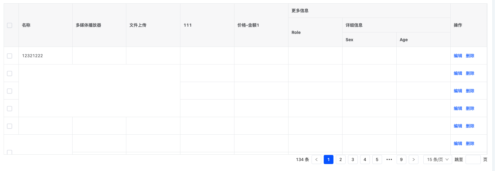
自定义表格支持合并或列、表头分组

点击下载对应的代码

在学习该文章之前,你需要先了解:

1: 自定义视图
2: 自定义视图、字段只修改 UI,不修改数据和逻辑
3: 自定义视图动态渲染界面设计器配置的视图、动作


1. 自定义 widget

创建自定义的 MergeTableWidget,用于支持合并单元格和表头分组。

// MergeTableWidget.ts
import { BaseElementWidget, SPI, ViewType, TableWidget, Widget, DslRender } from '@kunlun/dependencies';
import MergeTable from './MergeTable.vue';

@SPI.ClassFactory(
  BaseElementWidget.Token({
    viewType: ViewType.Table,
    widget: 'MergeTableWidget'
  })
)
export class MergeTableWidget extends TableWidget {
  public initialize(props) {
    super.initialize(props);
    this.setComponent(MergeTable);
    return this;
  }

  /**
   * 表格展示字段
   */
  @Widget.Reactive()
  public get currentModelFields() {
    return this.metadataRuntimeContext.model.modelFields.filter((f) => !f.invisible);
  }

  /**
   * 渲染行内动作VNode
   */
  @Widget.Method()
  protected renderRowActionVNodes() {
    const table = this.metadataRuntimeContext.viewDsl!;

    const rowAction = table?.widgets.find((w) => w.slot === 'rowActions');
    if (rowAction) {
      return rowAction.widgets.map((w) => DslRender.render(w));
    }

    return null;
  }
}

2. 创建对应的 Vue 组件

定义一个支持合并单元格与表头分组的 Vue 组件。

<!-- MergeTable.vue -->
<template>
  <vxe-table
    border
    height="500"
    :column-config="{ resizable: true }"
    :merge-cells="mergeCells"
    :data="showDataSource"
    @checkbox-change="checkboxChange"
    @checkbox-all="checkedAllChange"
  >
    <vxe-column type="checkbox" width="50"></vxe-column>
    <!-- 渲染界面设计器配置的字段 -->
    <vxe-column
      v-for="field in currentModelFields"
      :key="field.name"
      :field="field.name"
      :title="field.label"
    ></vxe-column>

    <!-- 表头分组  https://vxetable.cn/v4.6/#/table/base/group -->
    <vxe-colgroup title="更多信息">
      <vxe-column field="role" title="Role"></vxe-column>
      <vxe-colgroup title="详细信息">
        <vxe-column field="sex" title="Sex"></vxe-column>
        <vxe-column field="age" title="Age"></vxe-column>
      </vxe-colgroup>
    </vxe-colgroup>

    <vxe-column title="操作" width="120">
      <template #default="{ row, $rowIndex }">
        <!-- 渲染界面设计器配置的行内动作 -->
        <row-action-render
          :renderRowActionVNodes="renderRowActionVNodes"
          :row="row"
          :rowIndex="$rowIndex"
          :parentHandle="currentHandle"
        ></row-action-render>
      </template>
    </vxe-column>
  </vxe-table>

  <!-- 分页 -->
  <oio-pagination
    :pageSizeOptions="pageSizeOptions"
    :currentPage="pagination.current"
    :pageSize="pagination.pageSize"
    :total="pagination.total"
    show-total
    :showJumper="paginationStyle != ListPaginationStyle.SIMPLE"
    :showLastPage="paginationStyle != ListPaginationStyle.SIMPLE"
    :onChange="onPaginationChange"
  ></oio-pagination>
</template>

<script lang="ts">
import { defineComponent, PropType, ref } from 'vue';
import { CheckedChangeEvent } from '@kunlun/vue-ui';
import { ActiveRecord, ActiveRecords, ManualWidget, Pagination, RuntimeModelField } from '@kunlun/dependencies';
import { ListPaginationStyle, OioPagination, OioSpin, ReturnPromise } from '@kunlun/vue-ui-antd';
import RowActionRender from './RowActionRender.vue';

export default defineComponent({
  mixins: [ManualWidget],
  components: {
    OioSpin,
    OioPagination,
    RowActionRender
  },
  inheritAttrs: false,
  props: {
    currentHandle: {
      type: String,
      required: true
    },
    // loading
    loading: {
      type: Boolean,
      default: undefined
    },
    // 表格展示的数据
    showDataSource: {
      type: Array as PropType<ActiveRecord[]>
    },

    // 分页
    pagination: {
      type: Object as PropType<Pagination>,
      required: true
    },

    pageSizeOptions: {
      type: Array as PropType<(number | string)[]>,
      required: true
    },

    paginationStyle: {
      type: String as PropType<ListPaginationStyle>
    },

    // 修改分页
    onPaginationChange: {
      type: Function as PropType<(currentPage: number, pageSize: number) => ReturnPromise<void>>
    },

    // 表格选中
    onCheckedChange: {
      type: Function as PropType<(data: ActiveRecords, event?: CheckedChangeEvent) => void>
    },

    // 表格全选
    onCheckedAllChange: {
      type: Function as PropType<(selected: boolean, data: ActiveRecord[], event?: CheckedChangeEvent) => void>
    },

    // 展示字段
    currentModelFields: {
      type: Array as PropType<RuntimeModelField[]>
    },

    // 渲染行内动作
    renderRowActionVNodes: {
      type: Function as PropType<(row: any) => any>,
      required: true
    }
  },
  setup(props, ctx) {
    /**
     * 单元格合并
     * https://vxetable.cn/v4.6/#/table/advanced/span
     */
    const mergeCells = ref([
      { row: 1, col: 1, rowspan: 3, colspan: 3 },
      { row: 5, col: 0, rowspan: 2, colspan: 2 }
    ]);

    // 单选
    const checkboxChange = (e) => {
      const { checked, record, records } = e;
      const event: CheckedChangeEvent = {
        checked,
        record,
        records,
        origin: e
      };

      props.onCheckedChange?.(records, event);
    };

    // 全选
    const checkedAllChange = (e) => {
      const { checked, record, records } = e;
      const event: CheckedChangeEvent = {
        checked,
        record,
        records,
        origin: e
      };

      props.onCheckedAllChange?.(checked, records, event);
    };

    return {
      mergeCells,
      ListPaginationStyle,
      checkboxChange,
      checkedAllChange
    };
  }
});
</script>

<style lang="scss"></style>

3. 创建行内动作

<script lang="ts">
import { ActionBar, RowActionBarWidget } from '@kunlun/dependencies';
import { debounce } from 'lodash-es';
import { createVNode, defineComponent } from 'vue';

export default defineComponent({
  inheritAttrs: false,
  props: {
    row: {
      type: Object,
      required: true
    },
    rowIndex: {
      type: Number,
      required: true
    },
    renderRowActionVNodes: {
      type: Function,
      required: true
    },
    parentHandle: {
      type: String,
      required: true
    }
  },
  render() {
    const vnode = this.renderRowActionVNodes();

    return createVNode(
      ActionBar,
      {
        widget: 'rowAction',
        parentHandle: this.parentHandle,
        inline: true,
        activeRecords: this.row,
        rowIndex: this.rowIndex,
        key: this.rowIndex,
        refreshWidgetRecord: debounce((widget?: RowActionBarWidget) => {
          if (widget) {
            widget.setCurrentActiveRecords(this.row);
          }
        })
      },
      {
        default: () => vnode
      }
    );
  }
});
</script>

4. 注册布局

// registry.ts

import { registerLayout, ViewType } from '@kunlun/dependencies';

registerLayout(
  `<view type="TABLE">
    <pack widget="group">
        <view type="SEARCH">
            <element widget="search" slot="search" slotSupport="field">
                <xslot name="searchFields" slotSupport="field" />
            </element>
        </view>
    </pack>
    <pack widget="group" slot="tableGroup">
        <element widget="actionBar" slot="actionBar" slotSupport="action">
            <xslot name="actions" slotSupport="action" />
        </element>
        <element widget="MergeTableWidget" slot="table" slotSupport="field">
            <element widget="expandColumn" slot="expandRow" />
            <xslot name="fields" slotSupport="field" />
            <element widget="rowActions" slot="rowActions" slotSupport="action" />
        </element>
    </pack>
</view>`,
  {
    model: '模型',
    viewType: ViewType.Table,
    actionName: '动作名称'
  }
);

通过上述步骤,自定义表格可以实现单元格合并和表头分组功能,同时支持动态渲染界面设计器配置的字段和动作。

Oinone社区 作者:汤乾华原创文章,如若转载,请注明出处:https://doc.oinone.top/frontend/20274.html

访问Oinone官网:https://www.oinone.top获取数式Oinone低代码应用平台体验

(0)
汤乾华的头像汤乾华数式员工
上一篇 2025年1月9日 pm5:12
下一篇 2025年1月10日 pm7:57

相关推荐

  • 【路由】浏览器地址栏url参数介绍

    介绍 浏览器地址栏url为路由类型的视图动作(viewAction)的访问url 详情页示例url https://one.oinone.top/page;module=resource;viewType=DETAIL;model=resource.ResourceDistrict;action=redirectDetailPage;scene=redirectDetailPage;target=ROUTER;menu=%7B%22selectedKeys%22:%5B%22%E5%8C%BA%22%5D,%22openKeys%22:%5B%22%E5%9C%B0%E5%9D%80%E5%BA%93%22,%22%E5%9C%B0%E5%8C%BA%22%5D%7D;id=575733837679260950;path=%2Fresource%2F%E5%8C%BA%2FACTION%23resource.ResourceDistrict%23redirectDetailPage 通过调试工具查看解析后的信息 参数介绍 module 动作所在模块名称 viewType 视图类型 model 动作所在模型的编码 action 动作名称 target 动作打开方式,ROUTER为当前路由打开,OPEN_WINDOW为新窗口打开 menu 【选填】菜单栏控制参数,该参数不影响页面的业务逻辑,仅影响菜单栏展开哪些菜单项(通过openKeys属性),选中哪些菜单项(通过selectedKeys属性)),该参数经过JSON.stringify(menu)方式处理过 # 示例参数 { "selectedKeys": ["区"], "openKeys": ["地址库", "地区"] } id 【选填】详情、编辑等单行数据页面的数据id searchBody 列表页搜索区域的搜索条件,该参数在前端经过encodeURIComponent(JSON.stringify(searchBody))方式处理过 # 示例参数 { "code": "11" } searchConditions 列表页高级搜索条件,用于处理searchBody之外的复杂搜索条件,日常开发中无需关心该参数encodeURIComponent(JSON.stringify(searchConditions))方式处理过 # 示例参数 [ { "leftValue":["sourceType"], "operator":"==", "right":"GD" } ] context 上下文参数,该参数经过JSON.stringify(menu)方式处理过 列表页的此参数会填充到搜索区域的字段中作为默认的查询条件,详情 详情页和表单页此参数会作为页面加载函数的入参 # 示例参数 { “cateId”: “61723712399821” } path 权限验证路径,父页面编译的时候自动加上该参数,在父页面点击当前动作的时候会自动拼该参数 scene 【选填】动作场景值 代码中如何获取 这里介绍在组件内如何获取 import { BaseElementWidget } from ‘@kunlun/dependencies’; export class DemoElementWidget extends BaseElementWidget { protected test() { const { module, model, action } = this.urlParameters; } } 推荐阅读相关文档 上下文在字段和动作中的应用 如何实现页面间的跳转

    2024年8月19日
    3.7K00
  • 表格主题配置(v4)

    TableThemeConfig /** * 表格主题配置 */ export interface TableThemeConfig { border: boolean | string; stripe: boolean; isCurrent: boolean; isHover: boolean; /** * 表格列主题配置 */ column: Partial<TableColumnThemeConfig>; } /** * 表格列主题配置 */ export interface TableColumnThemeConfig { /** * <h3>最小宽度</h3> * <ul> * <li>boolean: enabled column width auto compute</li> * <li>number: using css width (default: px)</li> * <li>string: using css width</li> * <li> * object: auto compute width for label by default function * <ul> * <li>min: min min width (default: 120)</li> * <li>max: max min width (default: 432)</li> * <li>chineseWidth: chinese width (default: 14 -> fontSize: 14px)</li> * <li>otherWidth: non chinese width (default: 9 -> fontSize: 14px)</li> * <li>sortableFixWidth: sortable handle width (default: 40)</li> * <li>nonSortableFixWidth: non sortable fix width (default: 22)</li> * </ul> * </li> * <li>function: auto compute width for label by function</li> * </ul> */ minWidth: boolean | number | string | Partial<TableColumnMinWidthComputeConfig> | TableColumnMinWidthComputeFunction; /** * 操作列 */ operation: { /** * 宽度 (default: 165) */ width?: number | string; /** * 最小宽度 (default: 120) */ minWidth?: number | string; }; } export interface TableColumnMinWidthComputeConfig { min: number;…

    2023年11月6日
    1.3K00
  • 前端自定义组件之多页面步骤条

    本文将讲解如何通过自定义,实现多页面的步骤条组件。其中每个步骤的元素里都对应界面设计器的一个页面。以下是代码实现和原理分析。 代码实现 NextStepWidget 多页面步骤条 ts 组件 import { CallChaining, createRuntimeContextByView, customMutation, customQuery, RuntimeView, SPI, ViewCache, Widget, DefaultTabsWidget, BasePackWidget } from '@oinone/kunlun-dependencies'; import { isEmpty } from 'lodash-es'; import { MyMetadataViewWidget } from './MyMetadataViewWidget'; import NextStep from './NextStep.vue'; import { IStepConfig, StepDirection } from './type'; @SPI.ClassFactory(BasePackWidget.Token({ widget: 'NextStep' })) export class NextStepWidget extends DefaultTabsWidget { public initialize(props) { this.titles = props.template?.widgets?.map((item) => item.title) || []; props.template && (props.template.widgets = []); super.initialize(props); this.setComponent(NextStep); return this; } @Widget.Reactive() public get invisible() { return false; } // 配置的每一步名称 @Widget.Reactive() public titles = []; // region 上一步下一步配置 // 步骤配置,切换的顺序就是数组的顺序,模型没有限制 @Widget.Reactive() public get stepJsonConfig() { let data = JSON.parse( this.getDsl().stepJsonConfig || '[{"model":"resource.ResourceCountry","viewName":"国家form"},{"model":"resource.ResourceProvince","viewName":"省form"},{"model":"resource.ResourceCity","viewName":"市form"}]' ); return data as IStepConfig[]; } // 切换上一步下一步 @Widget.Method() public async onStepChange(stepDirection: StepDirection) { // 没有激活的,说明是初始化,取第一步 if (!this.activeStepKey) { const step = this.stepJsonConfig[0]; if (step) { this.activeStepKey = `${step.model}_${step.viewName}`; await this.initStepView(step); } return; } // 获取当前步骤的索引 if (this.currentActiveKeyIndex > -1) { await this.onSave(); // 获取下一步索引 const nextStepIndex = stepDirection === StepDirection.NEXT ? this.currentActiveKeyIndex + 1 : this.currentActiveKeyIndex – 1; // 在索引范围内,则渲染视图 if (nextStepIndex >= 0 && nextStepIndex < this.stepJsonConfig.length) { const nextStep = this.stepJsonConfig[nextStepIndex];…

    2025年7月21日
    74800
  • 列表视图、卡片视图切换

    在日常项目开发中,我们可能会遇到当前视图是个表格,通过某个操作按钮将它变成卡片的形式. 这篇文章将带大家实现这种功能。通过上面两张图片可以看到出来不管是表格还是卡片,它都在当前的视图里面,所以我们需要一个视图容器来包裹表格跟卡片,并且表格可以使用平台默认的表格渲染,我们只需要自定义卡片即可。 我们用资源模块下面的国家菜单来实现这么一个功能这是对应的URL: http://localhost:8080/page;module=resource;viewType=TABLE;model=resource.ResourceCountry;action=resource%23%E5%9B%BD%E5%AE%B6;scene=resource%23%E5%9B%BD%E5%AE%B6;target=OPEN_WINDOW;menu=%7B%22selectedKeys%22:%5B%22%E5%9B%BD%E5%AE%B6%22%5D,%22openKeys%22:%5B%22%E5%9C%B0%E5%9D%80%E5%BA%93%22,%22%E5%9C%B0%E5%8C%BA%22%5D%7D 源码下载 views 创建外层的视图容器 刚刚我们讲过,不管是表格还是卡片,它都在当前的视图里面,所以我们需要写一个视图容器来包裹它们,并且对应的容器里面允许拆入表格跟卡片,我们先创建TableWithCardViewWidget.ts // TableWithCardViewWidget.ts import { BaseElementWidget, SPI, Widget } from '@kunlun/dependencies'; import TableWithCardView from './TableWithCardView.vue'; enum ListViewType { TABLE = 'table', CARD = 'card' } @SPI.ClassFactory( BaseElementWidget.Token({ widget: 'TableWithCardViewWidget' }) ) export class TableWithCardViewWidget extends BaseElementWidget { @Widget.Reactive() private listViewType: ListViewType = ListViewType.TABLE; // 当前视图展示的类型,是展示卡片还是表格 public initialize(props) { if (!props.slotNames) { props.slotNames = ['tableWidget', 'cardWidget']; } super.initialize(props); this.setComponent(TableWithCardView); return this; } } 在TableWithCardViewWidget中的initialize函数中,我们定义了两个插槽: tableWidget、cardWidget,所以需要在对应的vue文件里面里接收这两个插槽 <template> <div class="list-view-wrapper"> <!– 表格插槽 –> <div style="height: 100%" v-if="listViewType === 'table'"> <slot name="tableWidget" /> </div> <!– 卡片插槽 –> <div v-if="listViewType === 'card'"> <slot name="cardWidget"></slot> </div> </div> </template> <script lang="ts"> import { defineComponent } from 'vue'; export default defineComponent({ props: ['listViewType', 'onChangeViewType'], inheritAttrs: false, setup(props, context) { const onChangeViewType = (listViewType) => { props.onChangeViewType(listViewType); }; } }); </script> 这样一来,我们就定义好了视图容器,接下来就是通过自定义layout的方式注册该容器 layout注册 import { registerLayout, ViewType } from '@kunlun/dependencies'; registerLayout( `<view type="TABLE"> <pack widget="group"> <view type="SEARCH"> <element widget="search" cols="4" slot="search"/> </view> </pack> <pack widget="group" slot="tableGroup" style="position: relative"> <element widget="actionBar" slot="actionBar" slotSupport="action"> <xslot name="actions" slotSupport="action" /> </element> <element widget="TableWithCardViewWidget"> <template slot="tableWidget"> <element widget="table" slot="table" datasource-provider="true"> <element widget="expandColumn" slot="expandRow" /> <xslot name="fields" />…

    2024年10月16日
    2.2K01
  • 【界面设计器】树形表格

    阅读之前 你应该: 熟悉模型的增删改查相关内容。【界面设计器】模型增删改查基础

    2024年4月19日
    1.2K00

Leave a Reply

登录后才能评论