
在日常需求中也经常需要调整Layout的情况,如出现树表结构(左树右表、级联),我们则需要通过修改View的Layout来完成。今天就带您学习下Layout的自定义
第一个表格Layout
如果我们想去除表格视图区域的搜索区、ActionBar(操作区),就可以为视图自定义一个简单的Layout就行啦
Step1 新建一个表格的Layout
在views/demo_core/layout路径下增加一个名为sample_table_layout.xml文件,name设置为sampleTableLayout
<view type="TABLE" name="sampleTableLayout">
<!--    <view type="SEARCH">-->
<!--        <pack widget="fieldset">-->
<!--            <element widget="search" slot="search" slotSupport="field"/>-->
<!--        </pack>-->
<!--    </view>-->
    <pack widget="fieldset" style="height: 100%" wrapperStyle="height: 100%">
        <pack widget="row" style="height: 100%; flex-direction: column">
<!--            <pack widget="col" mode="full" style="flex: 0 0 auto">-->
<!--                <element widget="actionBar" slot="actionBar" slotSupport="action">-->
<!--                    <xslot name="actions" slotSupport="action" />-->
<!--                </element>-->
<!--            </pack>-->
            <pack widget="col" mode="full" style="min-height: 234px">
                <element widget="table" slot="table" slotSupport="field">
                    <xslot name="fields" slotSupport="field" />
                    <element widget="rowAction" slot="rowActions" slotSupport="action"/>
                </element>
            </pack>
        </pack>
    </pack>
</view>Step2 修改宠物达人自定义表格Template
在view标签上增加layout属性值为"sampleTableLayout"
<view name="tableView" model="demo.PetTalent" cols="1" type="TABLE" enableSequence="true" layout="sampleTableLayout">
……省略其他
</view>Step3 重启看效果

Step4 修改宠物达人自定义表格Template
去除在view标签上的layout属性配置,让其回复正常
第一个树表Layout
本节以“给商品管理页面以树表的方式增加商品类目过滤”为例
Step1 增加商品类目模型
增加PetItemCategory模型继承CodeModel,新增两个字段定义name和parent,其中parent字段M2O关联自身模型,非必填字段(如字段值为空即为一级类目):
package pro.shushi.pamirs.demo.api.model;

import pro.shushi.pamirs.meta.annotation.Field;
import pro.shushi.pamirs.meta.annotation.Model;
import pro.shushi.pamirs.meta.base.common.CodeModel;

@Model.model(PetItemCategory.MODEL_MODEL)
@Model(displayName = "宠物商品类目",summary="宠物商品类目",labelFields={"name"})
public class PetItemCategory extends CodeModel {

    public static final String MODEL_MODEL="demo.PetItemCategory";
    @Field(displayName = "类目名称",required = true)
    private String name;

    @Field(displayName = "父类目")
    @Field.many2one
    private PetItemCategory parent;
}
Step2 修改自定义商品模型
为商品模型PetItem增加一个category字段m2o关联PetItemCategory
@Field(displayName = "类目")
@Field.many2one
private PetItemCategory category;Step3 新增名为treeTableLayout的Layout
在views/demo_core/layout路径下增加一个名为tree_table_layout.xml文件,name设置为treeTableLayout
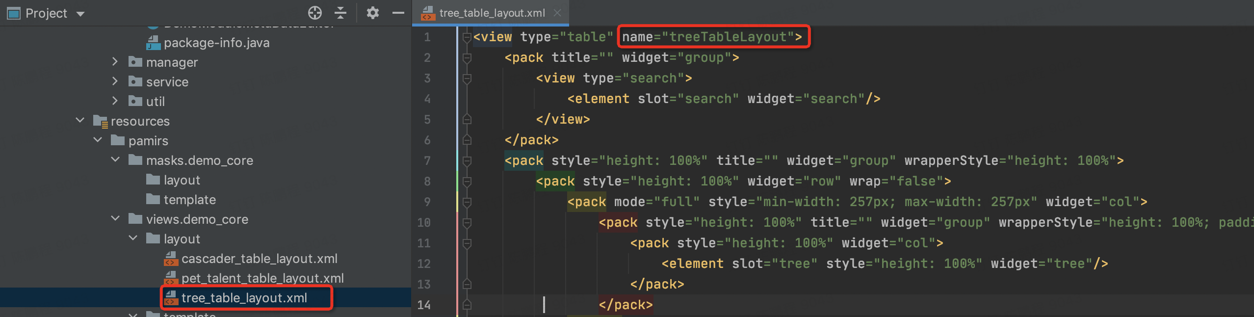
<view type="TABLE" name="treeTableLayout">
  <view type="SEARCH">
    <pack widget="fieldset">
      <element widget="search" slot="search" slotSupport="field"/>
    </pack>
  </view>
  <pack widget="fieldset" style="height: 100%" wrapperStyle="height: 100%">
    <pack widget="row" wrap="false" style="height: 100%">
      <pack widget="col" mode="full" style="min-width: 257px; max-width: 257px">
        <pack widget="fieldset" style="height: 100%" wrapperStyle="height: 100%; padding: 24px 16px">
          <pack widget="col" style="height: 100%">
            <element widget="tree" slot="tree" style="height: 100%" />
          </pack>
        </pack>
      </pack>
      <pack widget="col" mode="full" style="min-width: 400px">
        <pack widget="row" style="height: 100%; flex-direction: column">
          <pack widget="col" mode="full" style="width: 100%; flex: 0 0 auto">
            <element widget="actionBar" slot="actionBar" slotSupport="action">
              <xslot name="actions" slotSupport="action" />
            </element>
          </pack>
          <pack widget="col" mode="full" style="width: 100%; min-height: 345px">
            <element widget="table" slot="table" slotSupport="field">
              <xslot name="fields" slotSupport="field" />
              <element widget="rowAction" slot="rowActions" slotSupport="action" />
            </element>
          </pack>
        </pack>
      </pack>
    </pack>
  </pack>
</view>Step4 自定义商品管理的Template
-
在views/demo_core/template路径下增加一个名为pet_item_table.xml文件
-
跟普通自定义template的区别在于
a. 配置layout属性为【treeTableLayout】跟前面layout定义一致
b. 配置了widget为tree的template节点,node可以配置多个,node配置说明如下
ⅰ. model,模型编码,必填。
ⅱ. label,数据标题,支持表达式,必填。
ⅲ. labelFields,数据标题中使用的字段列表,必填。
ⅳ. references,层级关联字段,第一层无效,其他层必填。模型编码#字段。
ⅴ. selfReferences,自关联字段,模型编码#字段。
ⅵ. search,点击搜索字段,必须使用主表格字段。模型编码#字段。
ⅶ. filter,层级过滤条件。模型编码#字段。
以上所有使用#拼接的属性配置,与model一致的情况下,均可以省略模型编码。
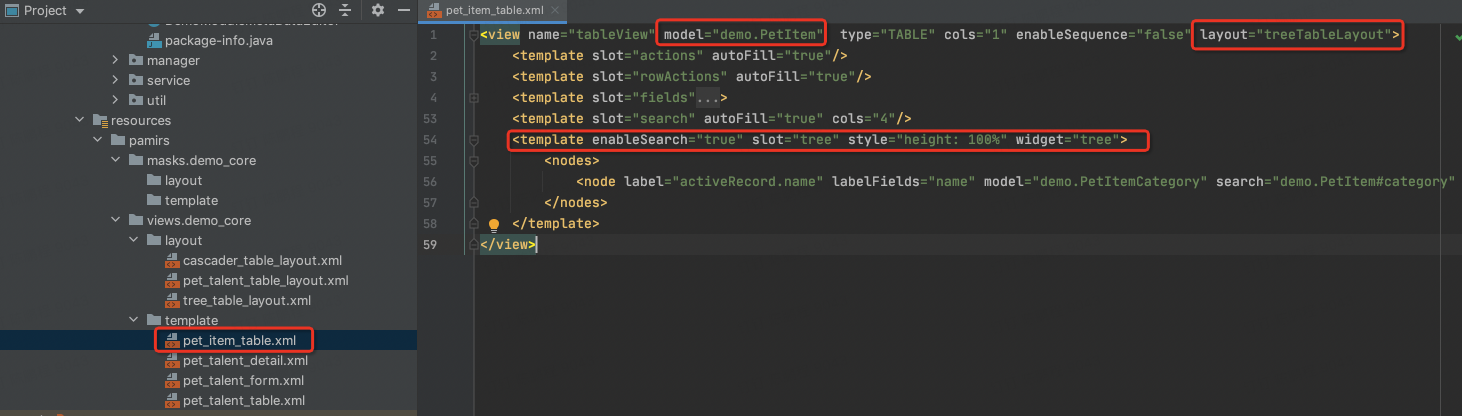
<view name="tableView" model="demo.PetItem"  type="TABLE" cols="1" enableSequence="false" layout="treeTableLayout">
  <template slot="actions" autoFill="true"/>
  <template slot="rowActions" autoFill="true"/>
  <template slot="fields">
    <field invisible="true" priority="5" data="id" label="ID" readonly="true"/>
    <field priority="90" data="code" label="编码"/>
    <field priority="101" data="itemName" label="商品名称"/>
    <field priority="101" data="dataStatus" label="数据状态">
      <options>
        <option name="DRAFT" displayName="草稿" value="DRAFT" state="ACTIVE"/>
        <option name="NOT_ENABLED" displayName="未启用" value="NOT_ENABLED" state="ACTIVE"/>
        <option name="ENABLED" displayName="已启用" value="ENABLED" state="ACTIVE"/>
        <option name="DISABLED" displayName="已禁用" value="DISABLED" state="ACTIVE"/>
      </options>
    </field>
    <field priority="102" data="price" label="商品价格"/>
    <field priority="103" data="shop" label="店铺">
      <options>
        <option references="demo.PetShop" referencesType="STORE" referencesLabelFields="shopName">
          <field name="shopName" data="shopName" ttype="STRING"/>
        </option>
      </options>
    </field>
    <field priority="104" data="shopId" label="店铺id"/>
    <field priority="105" data="type" label="品种">
      <options>
        <option references="demo.PetType" referencesType="STORE" referencesLabelFields="name">
          <field name="name" data="name" ttype="STRING"/>
        </option>
      </options>
    </field>
    <field priority="106" data="typeId" label="品种类型"/>
    <field priority="107" data="petItemDetails" label="详情">
      <options>
        <option references="demo.PetItemDetail" referencesType="TRANSIENT" referencesLabelFields="remark">
          <field name="remark" data="remark" ttype="STRING"/>
        </option>
      </options>
    </field>
    <field priority="108" data="tags" label="商品标签"/>
    <field priority="109" data="petTalents" label="推荐达人">
      <options>
        <option references="demo.PetTalent" referencesType="STORE" referencesLabelFields="name">
          <field name="name" data="name" ttype="STRING"/>
        </option>
      </options>
    </field>
    <field priority="200" data="createDate" label="创建时间" readonly="true"/>
    <field priority="210" data="writeDate" label="更新时间" readonly="true"/>
    <field priority="220" data="createUid" label="创建人id"/>
    <field priority="230" data="writeUid" label="更新人id"/>
  </template>
  <template slot="search" autoFill="true" cols="4"/>
  <template enableSearch="true" slot="tree" style="height: 100%" widget="tree">
    <nodes>
<!--       <node label="activeRecord.name" labelFields="name" model="demo.PetItemCategory" search="demo.PetItem#category" selfReferences="parent"/> -->
           <node label="activeRecord.name" labelFields="name" model="demo.PetItemCategory" search="demo.PetItem#category" selfReferences="demo.PetItemCategory#parent"/>
     </nodes>
   </template>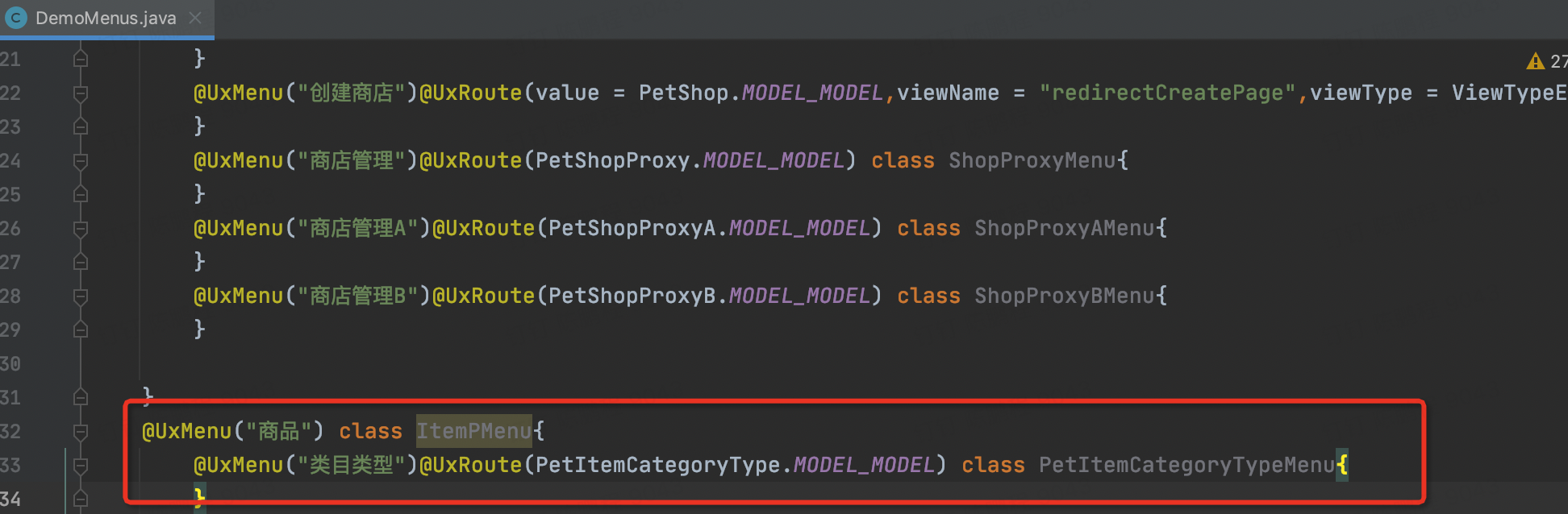
</view>Step5 为商品类目增加管理入口
修改DemoMenus类,增加类目管理菜单
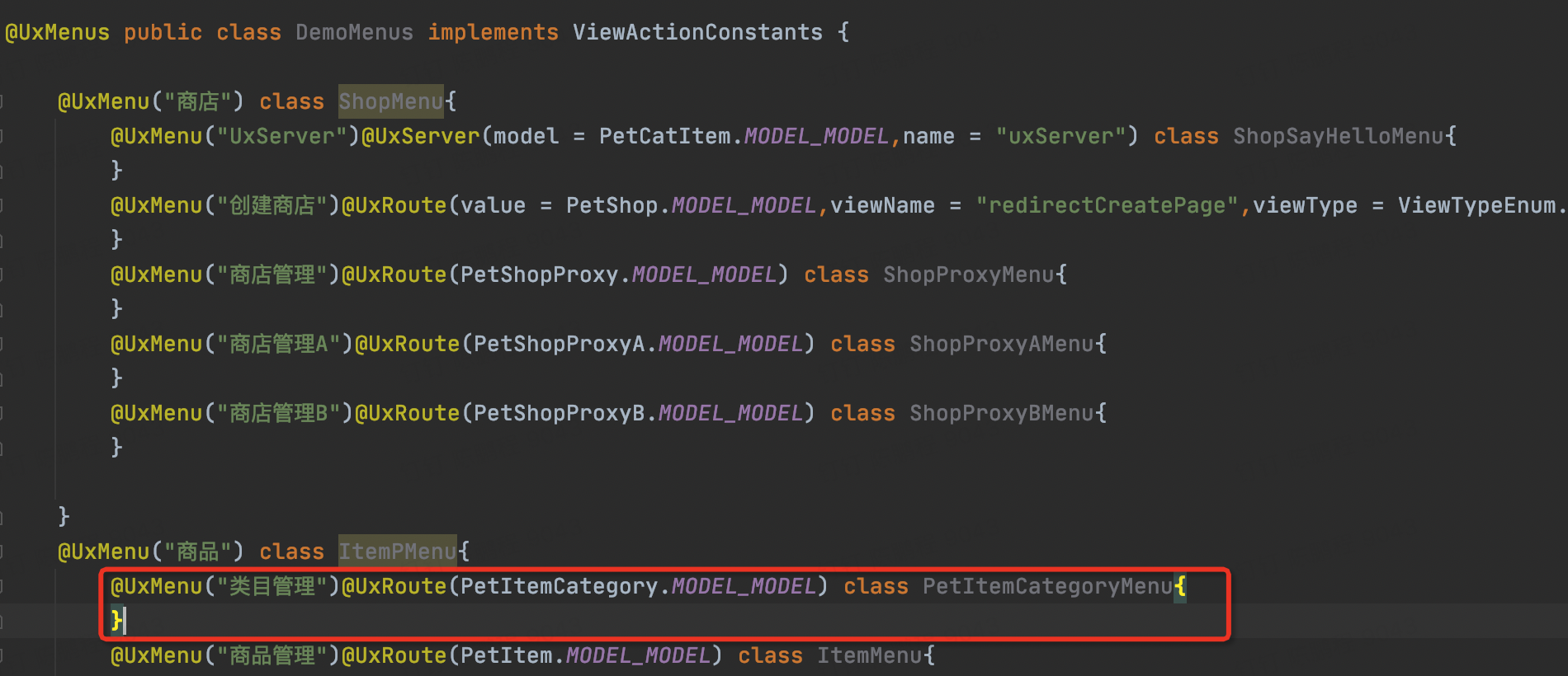
@UxMenu("类目管理")@UxRoute(PetItemCategory.MODEL_MODEL) class PetItemCategoryMenu{
}Step6 重启看效果
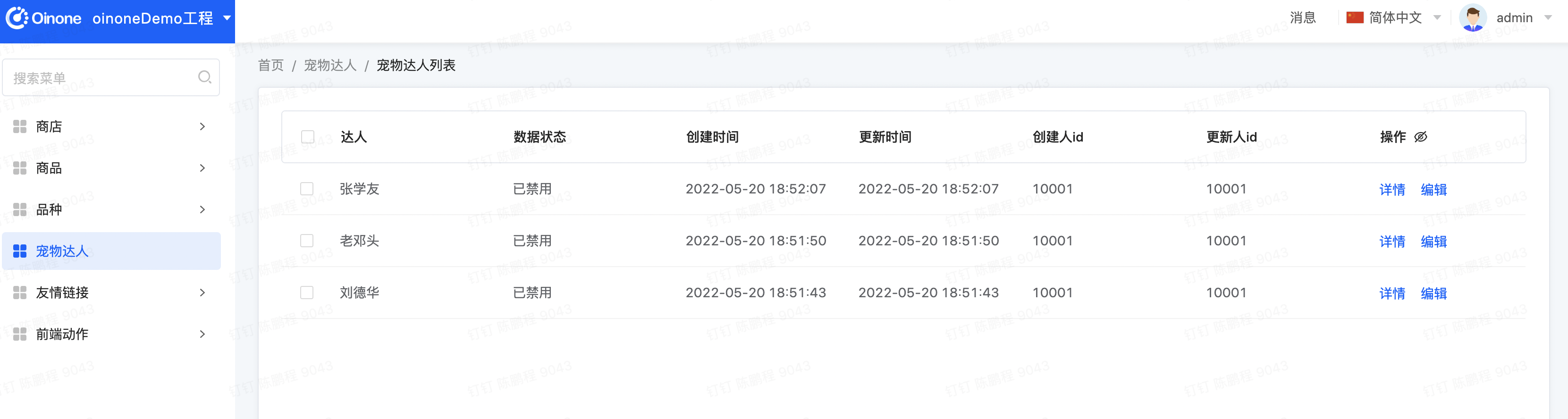
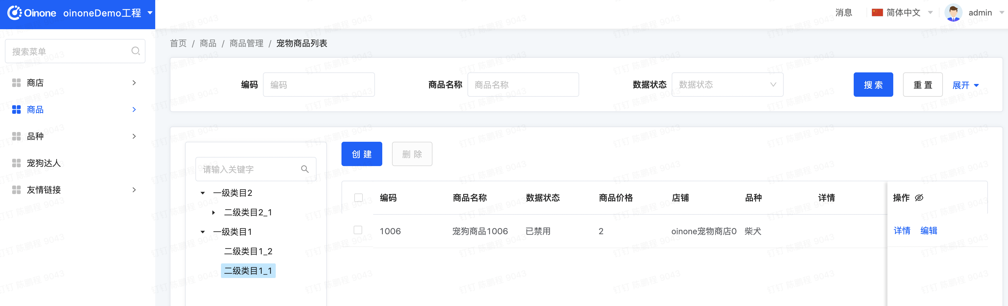
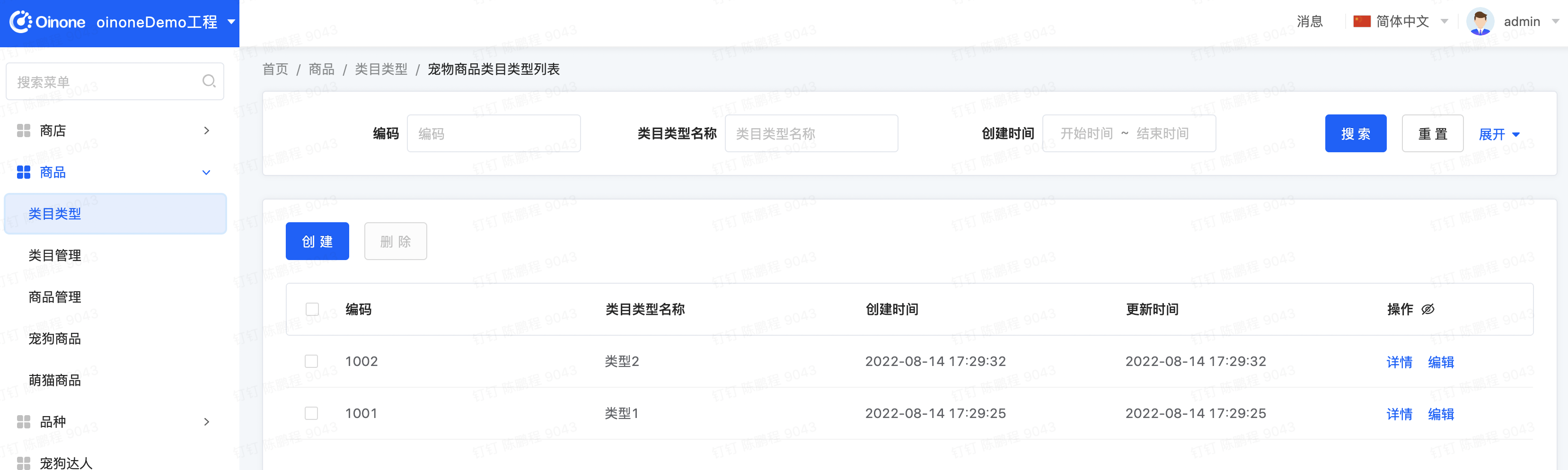
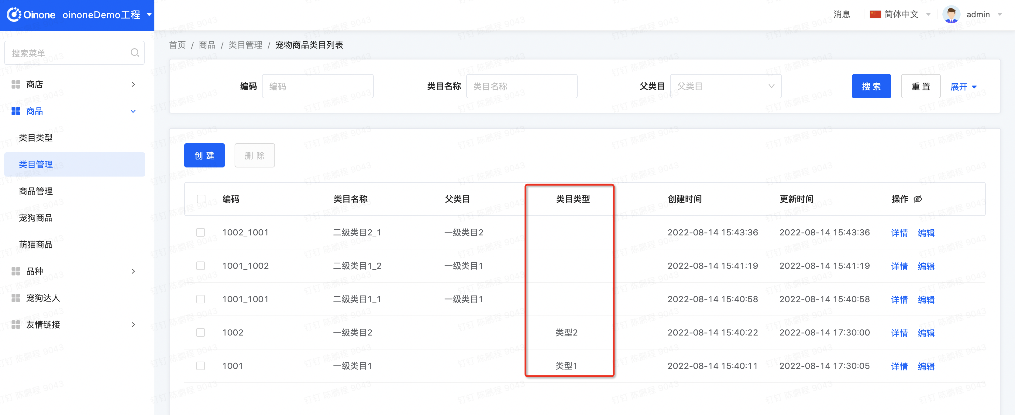
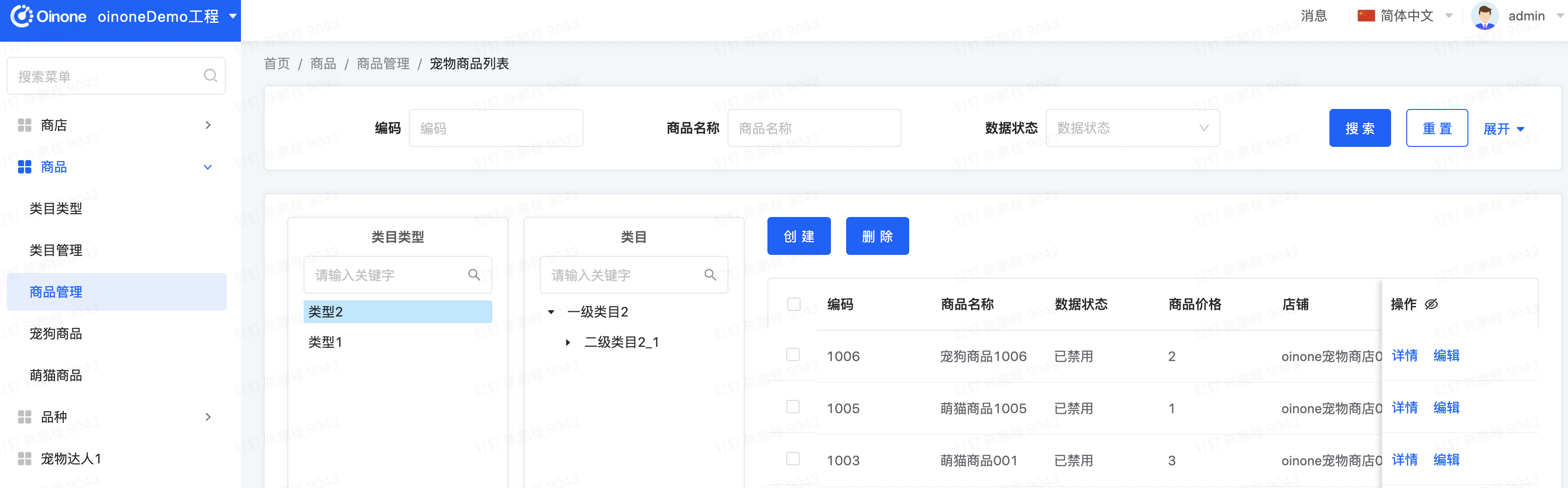
- 进入类目管理页面,新增商品类目数据
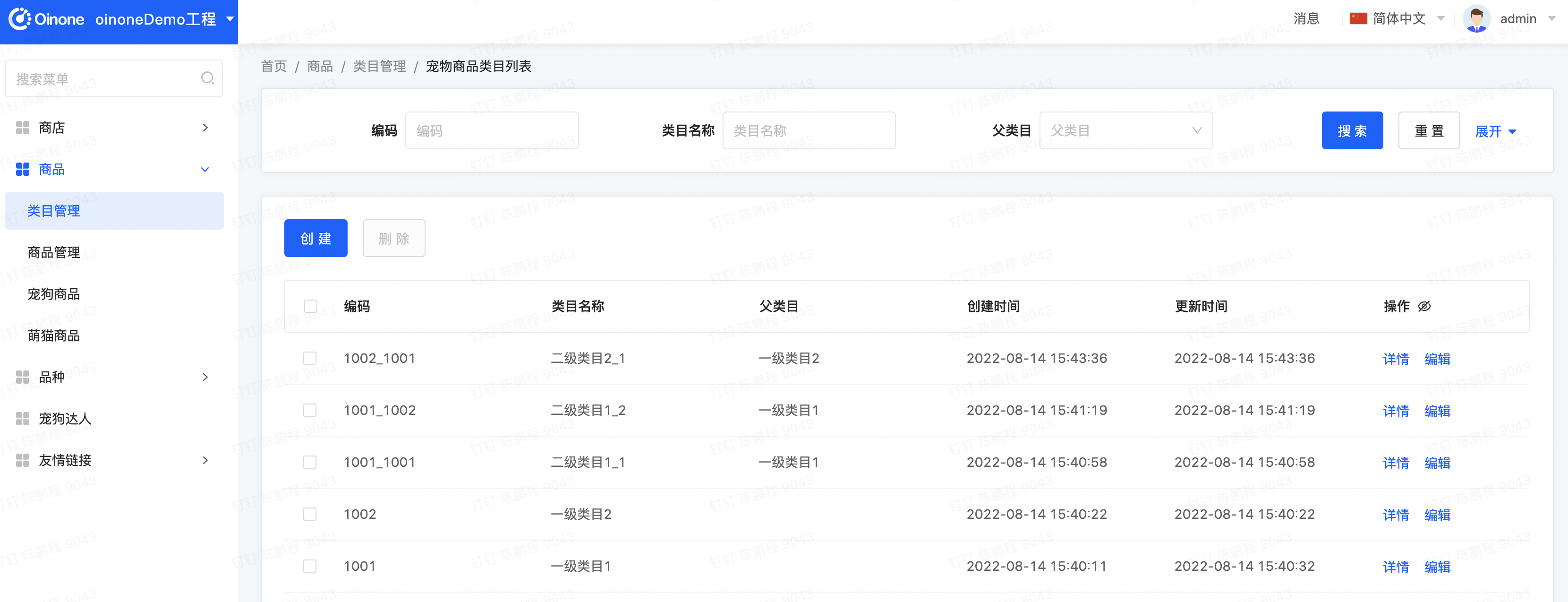
- 进入商品管理页面,找一行数据修改其类目字段,然后再点击左边树看过滤效果
第一个级联Layout
本节以“给商品管理页面以级联的方式增加商品类目过滤”为例,该例子中左边级联项由多个模型组成
Step1 增加商品类目类型模型
增加PetItemCategoryType模型集成CodeModel,新增两个字段定义name
package pro.shushi.pamirs.demo.api.model;

import pro.shushi.pamirs.meta.annotation.Field;
import pro.shushi.pamirs.meta.annotation.Model;
import pro.shushi.pamirs.meta.base.common.CodeModel;

@Model.model(PetItemCategoryType.MODEL_MODEL)
@Model(displayName = "宠物商品类目类型",summary="宠物商品类目类型",labelFields={"name"})
public class PetItemCategoryType extends CodeModel {

    public static final String MODEL_MODEL="demo.PetItemCategoryType";
    @Field(displayName = "类目类型名称",required = true)
    private String name;

}Step2 修改商品类目
为商品类目模型PetItemCategory增加一个type字段m2o关联PetItemCategoryType
@Field(displayName = "类目类型")
@Field.many2one
private PetItemCategoryType type;Step3 新增名为cascaderTableLayout的Layout
在views/demo_core/layout路径下增加一个名为cascader_table_layout.xml文件
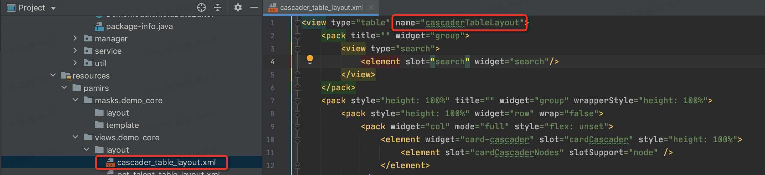
<view type="TABLE" name="cascaderTableLayout">
<view type="SEARCH">
    <pack widget="fieldset">
        <element widget="search" slot="search" slotSupport="field"/>
    </pack>
</view>
<pack widget="fieldset" style="height: 100%" wrapperStyle="height: 100%; overflow: auto">
    <pack widget="row" wrap="false" style="height: 100%">
        <pack widget="col" mode="full" style="flex: unset">
            <element widget="card-cascader" slot="cardCascader" style="height: 100%" />
        </pack>
        <pack widget="col" mode="full" style="min-width: 564px">
            <pack widget="row" style="height: 100%; flex-direction: column">
                <pack widget="col" mode="full" style="width: 100%; flex: 0 0 auto">
                    <element widget="actionBar" slot="actionBar" slotSupport="action">
                        <xslot name="actions" slotSupport="action" />
                    </element>
                </pack>
                <pack widget="col" mode="full" style="width: 100%; min-height: 345px">
                    <element widget="table" slot="table" slotSupport="field">
                        <xslot name="fields" slotSupport="field" />
                        <element widget="rowAction" slot="rowActions" slotSupport="action"/>
                    </element>
                </pack>
            </pack>
        </pack>
    </pack>
</pack>
</view>Step4 修改商品管理的Template
- 修改在views/demo_core/template路径下名为pet_item_table.xml的文件
a. 配置layout属性为【cascaderTableLayout】跟前面layout定义一致
b. 配置了widget为card-cascader的template节点,node可以配置多个,node配置跟树表的配置一致
<view name="tableView" model="demo.PetItem"  type="TABLE" cols="1" enableSequence="false" layout="cascaderTableLayout">
  <template slot="actions" autoFill="true"/>
  <template slot="rowActions" autoFill="true"/>
  <template slot="fields">
    <field invisible="true" priority="5" data="id" label="ID" readonly="true"/>
    <field priority="90" data="code" label="编码"/>
    <field priority="101" data="itemName" label="商品名称"/>
    <field priority="101" data="dataStatus" label="数据状态">
      <options>
        <option name="DRAFT" displayName="草稿" value="DRAFT" state="ACTIVE"/>
        <option name="NOT_ENABLED" displayName="未启用" value="NOT_ENABLED" state="ACTIVE"/>
        <option name="ENABLED" displayName="已启用" value="ENABLED" state="ACTIVE"/>
        <option name="DISABLED" displayName="已禁用" value="DISABLED" state="ACTIVE"/>
      </options>
    </field>
    <field priority="102" data="price" label="商品价格"/>
    <field priority="103" data="shop" label="店铺">
      <options>
        <option references="demo.PetShop" referencesType="STORE" referencesLabelFields="shopName">
          <field name="shopName" data="shopName" ttype="STRING"/>
        </option>
      </options>
    </field>
    <field priority="104" data="shopId" label="店铺id"/>
    <field priority="105" data="type" label="品种">
      <options>
        <option references="demo.PetType" referencesType="STORE" referencesLabelFields="name">
          <field name="name" data="name" ttype="STRING"/>
        </option>
      </options>
    </field>
    <field priority="106" data="typeId" label="品种类型"/>
    <field priority="107" data="petItemDetails" label="详情">
      <options>
        <option references="demo.PetItemDetail" referencesType="TRANSIENT" referencesLabelFields="remark">
          <field name="remark" data="remark" ttype="STRING"/>
        </option>
      </options>
    </field>
    <field priority="108" data="tags" label="商品标签"/>
    <field priority="109" data="petTalents" label="推荐达人">
      <options>
        <option references="demo.PetTalent" referencesType="STORE" referencesLabelFields="name">
          <field name="name" data="name" ttype="STRING"/>
        </option>
      </options>
    </field>
    <field priority="200" data="createDate" label="创建时间" readonly="true"/>
    <field priority="210" data="writeDate" label="更新时间" readonly="true"/>
    <field priority="220" data="createUid" label="创建人id"/>
    <field priority="230" data="writeUid" label="更新人id"/>
  </template>
  <template slot="search" autoFill="true" cols="4"/>
  <template enableSearch="true" slot="cardCascader" style="height: 100%" widget="card-cascader">
      <nodes>
          <node label="activeRecord.name" title="类目类型" labelFields="name" model="demo.PetItemCategoryType" />
          <node label="activeRecord.name" title="类目" labelFields="name" model="demo.PetItemCategory" search="demo.PetItem#category" references="demo.PetItemCategory#type" selfReferences="demo.PetItemCategory#parent"/>
      </nodes>
  </template>
</view>Step5 为商品类目类型增加管理入口
@UxMenu("类目类型")@UxRoute(PetItemCategoryType.MODEL_MODEL) class PetItemCategoryTypeMenu{
}Step6 重启看效果
- 进入类目类型管理页面,新增商品类目类型数据
- 进入类目管理页面,修改一级类目的类型
- 进入商品管理页面,找一行数据修改其类目字段,然后再点击左边级联项看过滤效果
树表与级联的更多配置
Oinone社区 作者:史, 昂原创文章,如若转载,请注明出处:https://doc.oinone.top/oio4/9254.html
访问Oinone官网:https://www.oinone.top获取数式Oinone低代码应用平台体验