
在3.5.3【Action的类型】一文中,我们介绍Action的几种类型,以及组合动作。
通用配置
| 配置项 | 可选值 | 默认值 | 作用 |
|---|---|---|---|
| name | 动作名称 | ||
| label | 显示名称 | ||
| icon | 图标 | ||
| type | primary defaultlink | primary | 按钮类型样式,支持主要样式、次要样式以及链接样式。 |
| bizStyle | defaultsuccesswarningdangerinfo | default | 按钮业务样式,支持成功(green)、警告(yellow)、危险(red)、信息(grey)四种样式。 |
| invisible | truefalse condition | false | 展示规则,有简单的true/false显隐,也支持复杂的表达式 |
| disabled | truefalse condition | 根据动作上下文类型进行自动推断 | 是否禁用自动推断规则:当上下文类型为【单行】时,相当于使用表达式LIST_COUNT(context.activeRecords) != 1当上下文类型为【多行】时,相当于使用表达式LIST_COUNT(context.activeRecords) <= 1当上下文类型为【单行或多行】时,相当于使用表达式LIST_COUNT(context.activeRecords) == 0 |
| disabledTitle | string | 根据动作上下文类型进行自动推断 | 禁用悬浮提示 |
二次确认配置
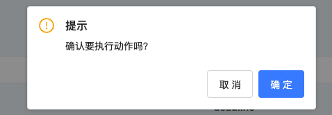
二次确认框默认支持两种模式,对话框和气泡框;
对话框

气泡框

配置项
| 配置项 | 可选值 | 默认值 | 作用 | 备注 |
|---|---|---|---|---|
| confirm | string | 二次确认提示文字 | 配置后开启二次确认 | |
| confirmType | POPPER(气泡提示框) MODAL(对话框) | POPPER | 确认框类型 | |
| confirmPosition | TM(按钮上方) BM(按钮下方) LM(按钮左侧) RM(按钮右侧) | BM | 确认框位置 | 气泡框该配置生效 |
| enterText | 确定 | 确定按钮文字 | ||
| cancelText | 取消 | 取消按钮文字 |
弹出层动作配置(窗口动作ViewAction)
目前平台对于弹出层支持了两种展示形式。弹窗(modal/dialog)和抽屉(drawer)
支持两种配置方式【内嵌视图配置】和【引用已有页面】,内嵌视图配置优先于引用已有页面。
内嵌视图配置
该配置对于弹窗和抽屉均适用。
<action name="窗口动作名称" label="创建">
    <view model="模型编码" type="form">
        <template slot="form" widget="form">
            <field data="id" invisible="true" />
            <field data="code" label="编码" widget="Input" />
            <field data="name" label="名称" widget="Input" />
        </template>
        <template slot="footer">
            <action name="$$internal_DialogCancel" label="关闭" type="default" />
            <action name="create" label="确定" />
        </template>
    </view>
</action>引用已有页面配置
该配置对于弹窗和抽屉均适用。
<view model="模型编码" type="form">
    <template slot="form" widget="form">
        <field data="id" invisible="true" />
        <field data="code" label="编码" widget="Input" />
        <field data="name" label="名称" widget="Input" />
    </template>
    <template slot="footer">
        <action name="$$internal_DialogCancel" label="关闭" type="default" />
        <action name="create" label="确定" />
    </template>
</view><action name="窗口动作名称" label="创建" resViewName="$viewName$" />弹窗
当窗口动作的路由方式(target)为dialog时,内嵌视图/引用页面将以弹窗形式展示在页面上。
配置项
| 配置项 | 可选值 | 默认值 | 作用 |
|---|---|---|---|
| title | string | 动作名称 | 标题名称 |
| width | string/number/enumsmall(560px)medium(890px)large(1200px) | medium | 宽度 |
示例:配置标题名称为【自定义创建弹窗】,宽度为70%的弹窗
<!-- 内嵌视图配置 -->
<action name="窗口动作名称" label="创建">
    <template slot="default" title="自定义创建弹窗" width="70%">
        <view model="模型编码" type="form">
            <template slot="form" widget="form">
                <field data="id" invisible="true" />
                <field data="code" label="编码" widget="Input" />
                <field data="name" label="名称" widget="Input" />
            </template>
            <template slot="footer">
                <action actionType="client" name="$$internal_DialogCancel" label="关闭" type="default" />
                <action name="create" label="确定" />
            </template>
        </view>
    </template>
</action>

<!-- 引用已有页面配置 -->
<action name="窗口动作名称" label="创建" resViewName="引用页面名称">
    <template slot="default" title="自定义创建弹窗" width="70%" />
</action>抽屉
当窗口动作的路由方式(target)为drawer时,内嵌视图/引用页面将以弹窗形式展示在页面上。
配置项
| 配置项 | 可选值 | 默认值 | 作用 | 备注 |
|---|---|---|---|---|
| title | string | 动作名称 | 标题名称 | |
| placement | top(上)right(右)bottom(下)left(左) | right | 抽屉打开位置 | |
| width | string/number/enumsmall(20%)medium(40%)large(80%) | small | 宽度 | 打开位置为left和right时生效 |
| height | string/number/enumsmall(20%)medium(40%)large(80%) | small | 宽度 | 打开位置为top和bottom时生效 |
示例:配置从下方打开,高度为large的抽屉
<!-- 内嵌视图配置 -->
<action name="窗口动作名称" label="创建">
    <template slot="default" placement="bottom" height="large">
        <view model="模型编码" type="form">
            <template slot="form" widget="form">
                <field data="id" invisible="true" />
                <field data="code" label="编码" widget="Input" />
                <field data="name" label="名称" widget="Input" />
            </template>
            <template slot="footer">
                <action actionType="client" name="$$internal_DialogCancel" label="关闭" type="default" />
                <action name="create" label="确定" />
            </template>
        </view>
    </template>
</action>

<!-- 引用已有页面配置 -->
<action name="窗口动作名称" label="创建" resViewName="引用页面名称">
    <template slot="default" placement="bottom" height="large" />
</action>组合动作配置
具体例子详见3.5.3【Aciton的类型】一文中介绍的“前端动作之组合动作”部分。
服务器动作串行
<action actionType="composition" label="组合动作">
    <action name="服务器动作1" />
    <action name="服务器动作2" />
</action>服务器动作与跳转动作组合执行
<action actionType="composition" label="组合动作">
    <action name="服务器动作1" />
    <action name="跳转动作1" />
</action>后端动作与前端动作组合
<action actionType="composition" label="组合动作">
    // 校验表单
    <action actionType="client" name="$$internal_ValidateForm" />
    <action name="服务器动作" />
    // 返回上一级页面
    <action actionType="client" name="$$internal_GotoListTableRouter" />
</action>展示规则
在介绍3.5.3【Action的类型】一文中的“ServerAction之前端展示规则(举例)”部分,用到invisible这个属性定义。这个在xml中也可以配置,而且前端的优先级高于后端
可以通过 invisible 属性配置一个表达式来使动作根据数据记录条件显示、隐藏。
如果 invisible 所引用的动作的 bindingType 是个列表型视图,则要用 context.activeRecords 获取当前选中记录,如果是个对象型视图或列表型视图的行内显示则需用 context.activeRecord:
<!-- 列表型视图 -->
<action name="a" invisible="context.activeRecords && context.activeRecords[0].a === true" />
<!-- 对象型视图或列表型视图的行内显示 -->
<action name="b" invisible="context.activeRecord && context.activeRecord.b === true" />举例
Table视图动作配置
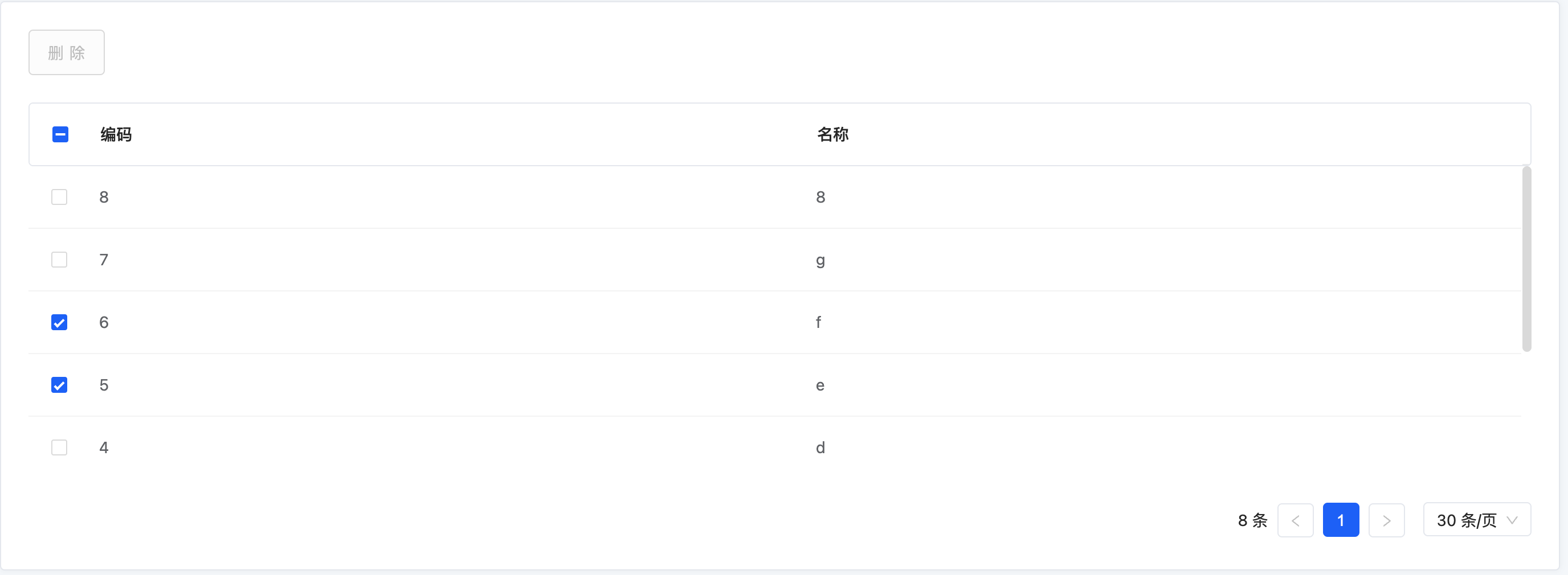
示例1:不允许删除编码为“5”的数据
PS:当配置disabled时,自动推断规则将会失效,需要按需配置。下方的配置保留了【单行或多行】的自动推断规则。
<view model="模型编码" type="table">
    <template slot="actionBar" widget="actionBar">
        <action name="delete" label="删除" disabled="LIST_COUNT(context.activeRecords) == 0 || LIST_CONTAINS(LIST_FIELD_VALUES(context.activeRecords, '', 'code'), '5')" refreshData="true" />
    </template>
    <template slot="fields">
        <field data="id" invisible="true" />
        <field data="code" label="编码" widget="Input" />
        <field data="name" label="名称" widget="Input" />
    </template>
</view>
结果展示
未选中时
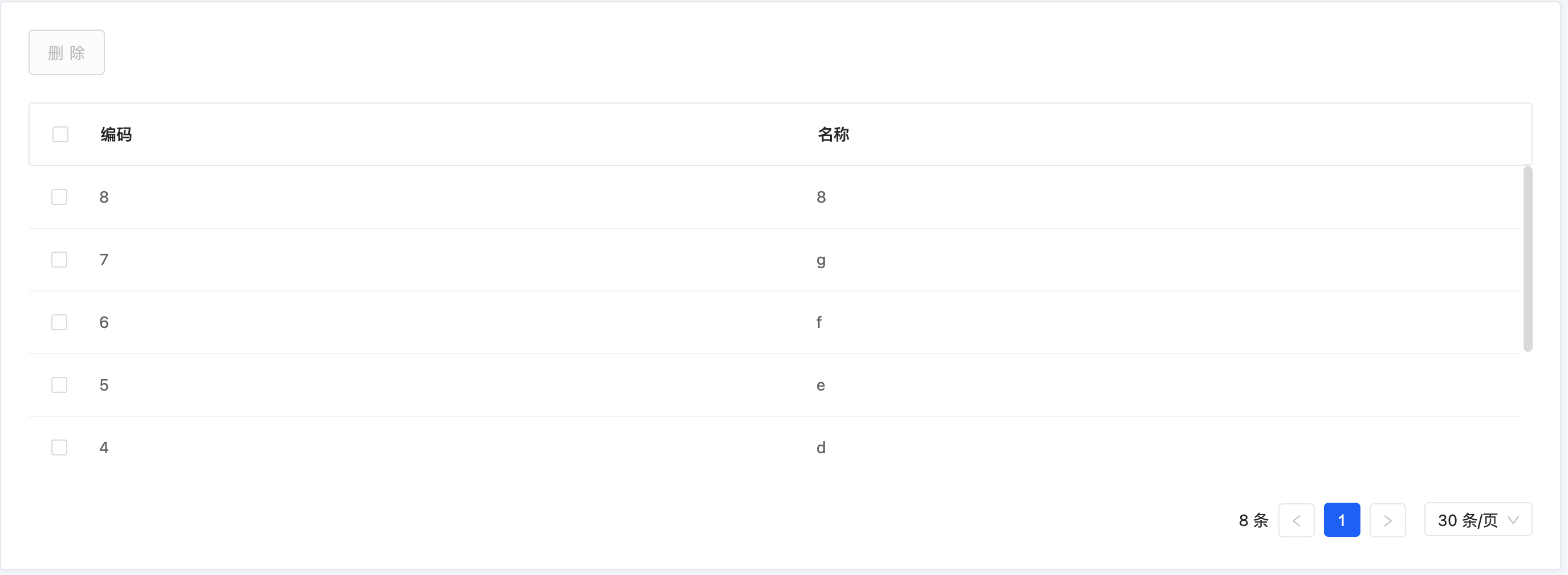
选中编码不是“5”的数据

选中编码包含“5”的数据
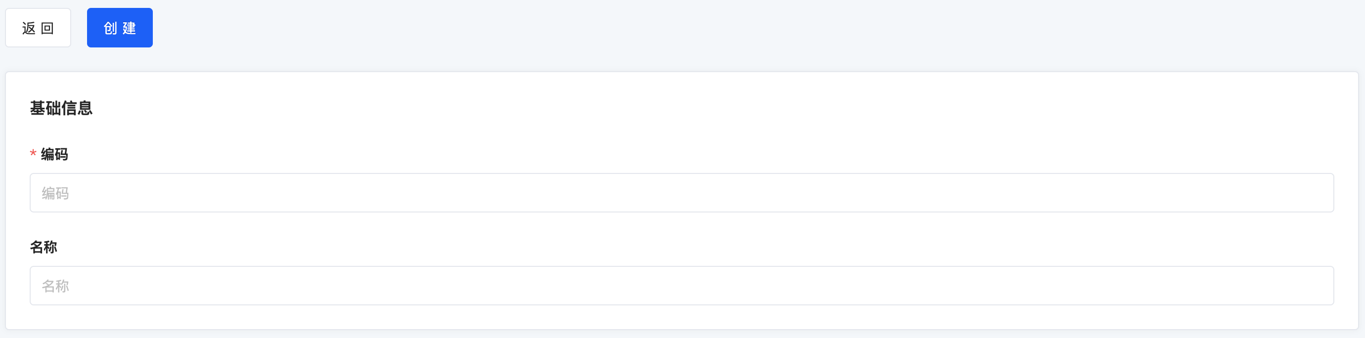
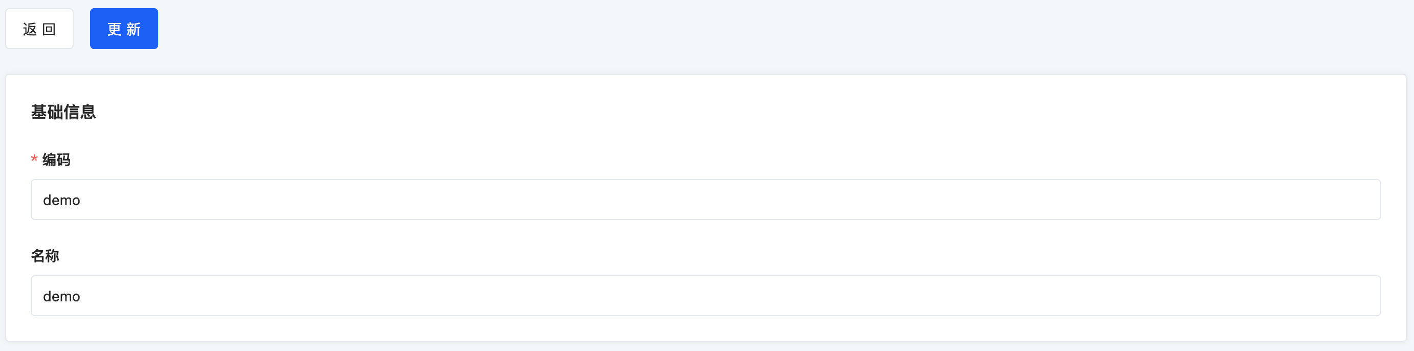
Form视图动作配置
示例:创建和编辑使用同一个视图配置
<view model="模型编码" type="form">
    <template slot="actionBar" widget="actionBar">
        <action actionType="client" name="$$internal_GotoListTableRouter" label="返回" type="default" />
        <action name="create" label="创建" invisible="!IS_NULL(activeRecord.id)" validateForm="true" goBack="true" />
        <action name="update" label="更新" invisible="IS_NULL(activeRecord.id)" validateForm="true" goBack="true" />
    </template>
    <template slot="fields">
        <pack widget="fieldset" title="基础信息">
            <field data="id" invisible="true" />
            <field data="code" label="编码" widget="Input" />
            <field data="name" label="名称" widget="Input" />
        </pack>
    </template>
</view>

<!-- 使用组合动作实现validateForm和goBack属性 -->
<view model="模型编码" type="form">
    <template slot="actionBar" widget="actionBar">
        <action actionType="client" name="$$internal_GotoListTableRouter" label="返回" type="default" />
        <action actionType="composition" label="创建" invisible="!IS_NULL(activeRecord.id)">
            <action actionType="client" name="$$internal_ValidateForm" />
            <action name="create" />
            <action actionType="client" name="$$internal_GotoListTableRouter" />
        </action>
        <action actionType="composition" label="更新" invisible="IS_NULL(activeRecord.id)">
            <action actionType="client" name="$$internal_ValidateForm" />
            <action name="update" />
            <action actionType="client" name="$$internal_GotoListTableRouter" />
        </action>
    </template>
    <template slot="fields">
        <pack widget="fieldset" title="基础信息">
            <field data="id" invisible="true" />
            <field data="code" label="编码" widget="Input" />
            <field data="name" label="名称" widget="Input" />
        </pack>
    </template>
</view>结果展示
使用【上下文无关】的跳转动作进入该视图时
使用【单行】的跳转动作进入该视图时
实战
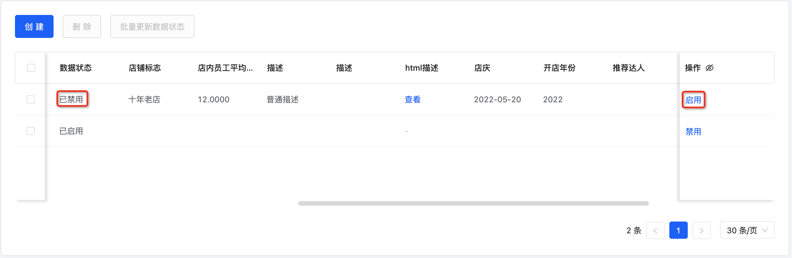
Step1 修改宠物商品代理表格视图的Template
启用和禁用服务器动作根据状态分别显示其中一个
<view name="tableView1" type="TABLE" cols="2" enableSequence="false" model ='demo.PetShopProxy' priority="1" >
    <template slot="actions" autoFill="true"/>
    <template slot="rowActions">
        <action name="dataStatusEnable" label="启用" invisible="activeRecord.dataStatus == 'ENABLED'" />
        <action name="dataStatusDisable" label="禁用" invisible="activeRecord.dataStatus == 'DISABLED'" />
    </template>
    <template slot="fields">
        <field priority="1" data="income" label="收入"/>
        <field priority="101" data="code" label="店铺编码"/>
        <field priority="102" data="relatedShopName" label="引用字段shopName"/>
        <field priority="102" data="codeTwo" label="店铺编码2"/>
        <field priority="103" data="createrId" label="引用创建者Id"/>
        <field priority="110" data="description" label="描述"/>
        <field priority="111" data="description1" label="描述"/>
        <field priority="112" data="descHtml" label="html描述"/>
        <field priority="113" data="anniversary" label="店庆"/>
        <field priority="114" data="publishYear" label="开店年份"/>
        <!-- 表格其他字段-->
    </template>
</view>Step2 重启看效果
【已启用】状态时只显示【禁用】按钮

【已禁用】状态时只显示【启用】按钮
Oinone社区 作者:史, 昂原创文章,如若转载,请注明出处:https://doc.oinone.top/oio4/9263.html
访问Oinone官网:https://www.oinone.top获取数式Oinone低代码应用平台体验