
在业务中,可能会遇到需要对菜单栏的交互或UI做全新设计的需求,这个时候可以自定义菜单栏组件支持。
首先继承平台的CustomMenuWidget 组件,将自己vue文件设置到component处
import { NavMenu, SPI, ViewWidget } from '@kunlun/dependencies';
import Component from './CustomMenu.vue';

@SPI.ClassFactory(
  ViewWidget.Token({
    // 这里的widget跟平台的组件一样,这样才能覆盖平台的组件
    widget: 'nav-menu'
  })
)
export class CustomMenuWidget extends NavMenu {

  public initialize(props) {
    super.initialize(props);
    this.setComponent(Component);
    return this;
  }
}
vue文件中继承平台的props,编写自定义页面代码
export const NavMenuProps = {
  /**
   * 当前模块
   */
  module: {
    type: Object as PropType<IModule | null>
  },
  /**
   * 树结构的菜单
   */
  menus: {
    type: Array as PropType<IResolvedMenu[]>,
    default: () => []
  },
  /**
   * 菜单类型,现在支持垂直、水平、和内嵌模式三种
   */
  mode: {
    type: String as PropType<'vertical' | 'horizontal' | 'inline'>,
    default: 'inline'
  },
  /**
   * 菜单栏是否折叠收起
   */
  collapsed: {
    type: Boolean,
    default: false
  },
  /**
   * 当前展开的 SubMenu 菜单项 key 数组
   */
  openKeys: {
    type: Array as PropType<string[]>,
    default: () => []
  },
  /**
   * 当前选中的菜单项 key 数组
   */
  selectKeys: {
    type: Array as PropType<string[]>,
    default: () => []
  },
  /**
   * 菜单搜索下拉选中菜单项
   */
  selectMenuBySearch: {
    type: Function as PropType<(menuName: String) => void>
  },
  /**
   * 选中菜单项
   */
  selectMenu: {
    type: Function as PropType<(menuName: String) => Promise<void>>
  },
  /**
   * SubMenu 展开/关闭的回调
   */
  openChange: {
    type: Function as PropType<(openKeys: string[]) => void>
  },
  /**
   * 菜单栏折叠的回调
   */
  onChangeCollapsed: {
    type: Function as PropType<(collapsed: boolean) => Promise<void>>
  }
};
<template>
  <div class="k-oinone-menu-wrapper custom-menu">
    <div class="menu-search" v-if="module && mode === 'inline' && !collapsed">
      <a-select
        ref="menuSelectSearch"
        dropdown-class-name="ui-designer-select-global"
        option-filter-prop="label"
        placeholder="搜索菜单"
        :show-search="true"
        @change="innerSearchSelect"
      >
        <a-select-option
          v-for="opt in module.allMenus.filter((_f) => _f.viewAction)"
          :key="opt.name"
          :value="opt.name"
          :label="opt.displayName"
        >
          {{ opt.displayName }}
        </a-select-option>
        <template #suffixIcon>
          <oio-icon icon="oinone-sousuo" size="14px" color="var(--oio-menu-default-icon-color)" />
        </template>
      </a-select>
    </div>
    <div class="menu-area oio-scrollbar">
      <div class="menu-content" :class="collapsed && 'collapsed'">
        <template v-for="item in menus" :key="item.key">
          <template v-if="!item.children || !item.children.length">
            <div :key="item.key" :title="item.title" class="root-menu" @click="selectMenu(item.key)">
              {{ item.title }}
            </div>
          </template>
          <template v-else>
            <div class="menu-group">
              <div class="root-menu" :title="item.title">{{ item.title }}</div>
              <div class="sub-menus">
                <template v-for="subItem in item.children" :key="subItem.key">
                  <div class="sub-menu" :title="subItem.title" @click="selectMenu(subItem.key)">
                    {{ subItem.title }}
                  </div>
                </template>
              </div>
            </div>
          </template>
        </template>
      </div>
    </div>

    <div class="menu-footer" :class="collapsed && 'collapsed'">
      <div class="menu-toggle-collapsed" @click="onChangeCollapsed(!collapsed)">
        <span class="collapsed-icon">
          <oio-icon
            :icon="collapsed ? 'oinone-menu-caidanzhankai' : 'oinone-menu-caidanshouqi'"
            size="16px"
            color="var(--oio-menu-default-icon-color)"
          />
        </span>
        <span v-show="!collapsed" class="collapsed-text">点击收起菜单</span>
      </div>
    </div>
  </div>
</template>
<script lang="ts">
import { defineComponent, ref, onMounted, nextTick } from 'vue';
import { OioIcon, NavMenuProps } from '@kunlun/dependencies';

export default defineComponent({
  props: {
    ...NavMenuProps
  },
  components: {
    OioIcon
  },
  setup(props) {
    const DEFAULT_MENU_ICON = 'oinone-menu-caidanmoren';

    onMounted(async () => {
      await nextTick();
      props.onChangeCollapsed?.(false);
    });

    const menuSelectSearch = ref();
    const innerSearchSelect = (menuName) => {
      props.selectMenuBySearch?.(menuName);
      menuSelectSearch.value?.blur?.();
    };
    return {
      DEFAULT_MENU_ICON,
      menuSelectSearch,
      innerSearchSelect
    };
  }
});
</script>
<style lang="scss">
.custom-menu {
  .root-menu,
  .sub-menu {
    text-indent: 12px;
    cursor: pointer;
    &:hover {
      background: rgba(var(--oio-primary-color-rgb), 0.1);
    }
  }
  .sub-menus {
    padding-left: 20px;
  }
}
</style>
文件目录结构如下图


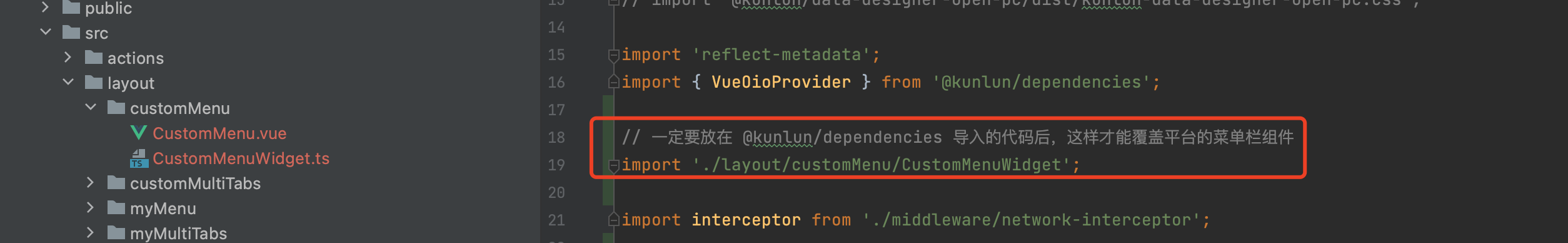
最后再到运行路径中导入该组件
这里以启动工程的 main.ts 举例,如果运行时未看到该组件的效果,请检查是否正确导入到运行时的路径中
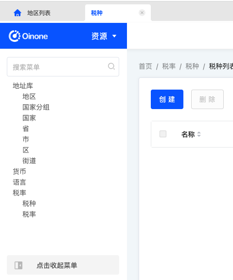
以上自定义菜单栏的页面效果如下(该组件仅供演示,所以未实现3级菜单,可自行用子组件实现)
Oinone社区 作者:史, 昂原创文章,如若转载,请注明出处:https://doc.oinone.top/oio4/9271.html
访问Oinone官网:https://www.oinone.top获取数式Oinone低代码应用平台体验